By El Ghali Bennis · Published
How to Make My Online Store Look Like Another Website
Want your store to have the polish of a site you admire? Here's how to copy a design style legally, step by step, without a designer.
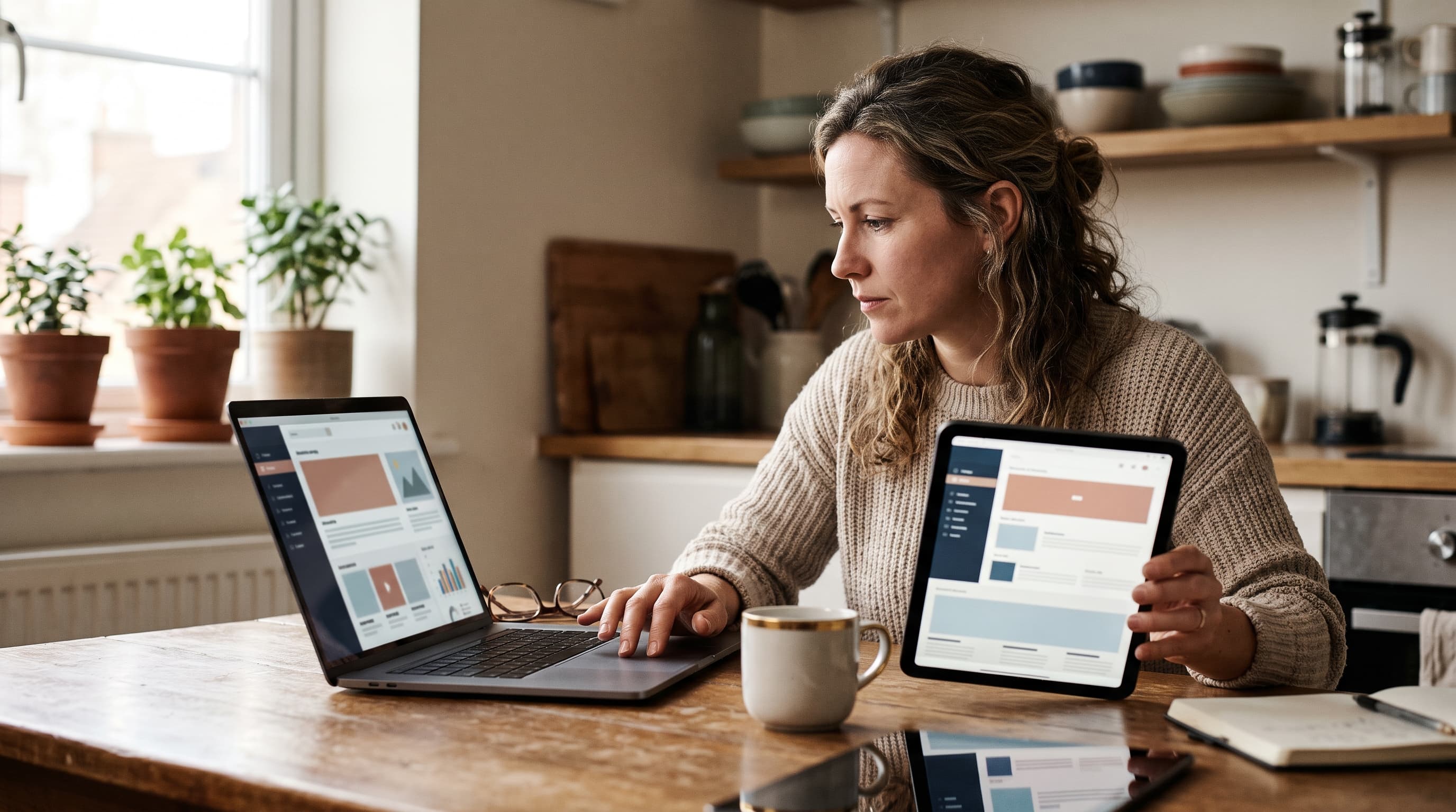
To make your online store look like another website, study the reference site's layout, color palette, typography and spacing, then rebuild those patterns with your own logo, photos, copy and code. You can copy a design style legally. You can't copy its exact code, images, text or brand identity.
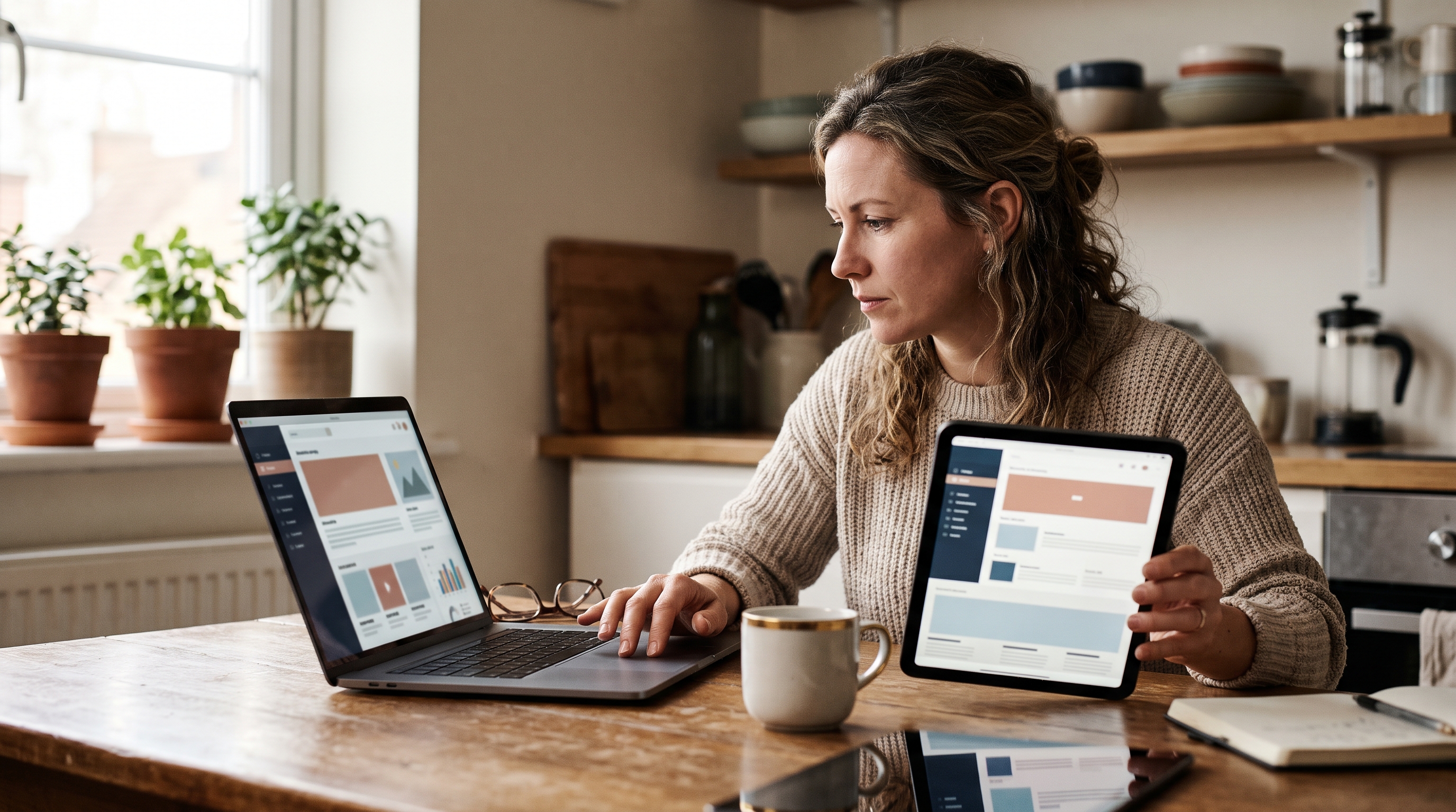
That distinction matters, and so does the method. Most store owners who say "I want my site to look like that one" don't actually want a clone. They want the same feeling: clean, trustworthy, expensive-looking. This guide shows you how to break a site you admire into parts, borrow what's fair to borrow, and apply it to your own store in an afternoon rather than a quarter.
Is it legal to copy a website design?
Copying a general look and feel (a clean grid, a neutral palette, big product photos) is generally legal. Copying protected expression is not: the actual code, photographs, illustrations, copywriting, logo and distinctive brand elements. This isn't legal advice, so check with a lawyer if you're unsure.
Design ideas like "a hero image with a short headline and one button" are common patterns nobody owns. What's protected is the specific expression. The U.S. Copyright Office explains at copyright.gov that copyright covers original works of authorship, not ideas or methods. Trademark law, covered by the USPTO, protects logos, brand names and sometimes distinctive trade dress.
What you can borrow
- Layout patterns: a three-column product grid, sticky header, announcement bar, split hero.
- Color relationships: a warm neutral background with one dark accent.
- Typography style: a serif headline with a clean sans-serif body.
- Spacing and rhythm: generous white space, consistent section padding.
- Page structure: the order of sections on a product page.
What you must not copy
- Their code, theme files or stylesheets, pasted wholesale.
- Product photos, lifestyle shots, icons or illustrations.
- Headlines, product descriptions and brand story text.
- Their logo, name, tagline or any lookalike that could confuse shoppers.
- Paid fonts without your own license.
A simple test: if a customer could land on your store and honestly think they're on the other brand's site, you've gone too far. Take the style, drop the identity.
How to analyze a competitor website design
Analyzing a competitor website design means breaking it into repeatable parts: structure, color, type, imagery and interaction. Spend 30 to 45 minutes on one reference site and write down what you see in each category. You'll end up with a spec you can actually build from.

- Screenshot the key pages. Capture the homepage, a collection page, a product page, the cart and the footer. Desktop and mobile.
- Map the section order. Write the homepage as a list: announcement bar, header, hero, featured collection, social proof, brand story, email signup. Our guide to ecommerce homepage design layouts and examples shows common orders that work.
- Note the density. How many products per row? How much space between sections? Sparse sites feel premium. Dense ones feel like a marketplace.
- Look at the details. Button shape (sharp or rounded), border use, shadows, hover effects, icon style.
- Check the mobile view. Most shoppers use phones, so see how the reference handles navigation and product galleries. Our mobile boutique website design guide covers what to watch for.
- Write down why it works. "Feels calm because there are only two colors and lots of space" is a more useful note than "looks nice."
For broader website design inspiration for ecommerce, don't limit yourself to direct competitors. Look at brands in adjacent categories with a feel you want. A candle shop can learn plenty from a skincare brand's product pages.
How to pick a color palette from a website
To pick a color palette from a website, sample the background, text, accent and button colors using a browser color picker or screenshot, then reduce them to four or five values. Most good storefronts use one background, one text color, one accent, and a neutral or two.

A simple extraction method
- Open the reference site and take a full-page screenshot.
- Use a free eyedropper tool (Chrome DevTools has one built in under the color picker) to sample the page background, body text, headings, primary button and link color.
- Record each as a hex code.
- Count how often each color appears. The dominant one is usually a near-white or near-black neutral.
- Shift your version slightly. Move the accent hue, or swap the neutral's warmth, so the palette belongs to you.
Then test contrast. The W3C's WCAG guidelines recommend a contrast ratio of at least 4.5:1 for normal body text. A pale grey on white might look elegant on someone's mood board and still fail your customers.
Typography pairing for ecommerce
Typography does more than color to make a site feel like another. Identify the reference site's headline and body fonts using a browser inspector (right-click, Inspect, look at the computed font-family). Then look for your own equivalents.
For website typography pairing ecommerce stores can trust, stick to two families at most:
- Elegant, editorial feel: a high-contrast serif headline like Playfair Display with a neutral sans body like Inter.
- Modern, friendly feel: a rounded sans like Poppins for headings, with the same family or DM Sans for body.
- Minimal, technical feel: one sans family in two weights.
Google Fonts at fonts.google.com offers free, commercially licensed options for nearly every style. If the reference uses a paid typeface, pick a free lookalike rather than pirating the original.
Ecommerce store design checklist: what to match
Matching a reference design means recreating its structure and polish, not just its colors. Use this ecommerce store design checklist to make sure you cover every layer that creates the "same feeling."
| Element | What to observe | How to make it yours |
|---|---|---|
| Header and navigation | Logo position, menu length, sticky behavior | Keep structure, use your logo and categories |
| Hero section | Image vs. video, headline length, button count | Shoot your own imagery, write original copy |
| Product grid | Columns, image ratio, hover effect | Match ratio and spacing, use your photos |
| Product page | Gallery layout, info order, trust badges | Reproduce the order, write your own descriptions |
| Color palette | Four to five hex values | Shift hue or warmth slightly |
| Typography | Two families, size scale | Use a free, licensed equivalent |
| Buttons and forms | Corner radius, fill, hover state | Copy the style rules, not the code |
| Footer | Columns, newsletter signup, policy links | Rebuild with your own links and content |
Product pages deserve extra attention because they decide whether a visitor buys. If you admire how a reference site presents products, our AI prompts for product page design turn that observation into instructions you can reuse. For clothing stores, the clothing collection page design guide breaks down grid layouts that move products fast.
Photography is the hidden 50%
Here's the part most people miss. A site looks expensive mostly because of its photography: consistent lighting, consistent backgrounds, consistent crop ratios. You can match a layout perfectly and still look nothing like the reference if your images are mismatched. Pick one background and one light direction, shoot everything the same way, and your store will look more cohesive than most.
Redesign an online store without a designer, on a budget
You can redesign an online store without a designer by working from a written spec (the one you built above), applying it through your platform's theme settings, and fixing photography first. Ecommerce design on a budget comes down to changing a few high-impact variables, not rebuilding everything.

Change store look without changing products
A brand refresh for online store owners can do in a weekend usually touches only these things:
- Colors: update your accent, background and button colors site-wide.
- Fonts: swap in your new heading and body pair.
- Homepage order: reorder sections to match your reference structure.
- Hero imagery: replace one or two images, not the whole catalog.
- Spacing: increase section padding. It's the cheapest way to look more premium.
- Buttons and badges: standardize radius and style.
Your catalog, prices, SEO URLs and customer data stay exactly as they are. That's what makes it a restyle rather than a rebuild.
What each route actually costs
Costs vary a lot by platform. Shopify's theme store at themes.shopify.com lists paid themes in the low hundreds of dollars, and a freelance designer to customize one typically adds more on top. Custom builds from agencies run far higher. Our breakdown of jewelry web design pricing shows how quickly those numbers climb in a single niche.
A lower-cost route is to use a platform where you describe the look you want and the design gets applied for you. That's how Rovela handles it: you tell it which style you're after, and it restyles your ecommerce storefront from the conversation, with your products, checkout and admin untouched. Stores run on standard Next.js code you can download, so you aren't locked into the look.
A realistic weekend plan
- Saturday morning: analyze the reference and write your spec (one hour), then reshoot hero and top product images (two to three hours).
- Saturday afternoon: apply palette and fonts site-wide.
- Sunday: restructure homepage and product pages, then test on your phone.
- Sunday evening: check page speed and contrast, then publish.
Common mistakes when copying a store's style
The most common mistake is copying surface details without the discipline underneath. Matching a reference design only works if you also match its restraint.
- Copying too many references. Mixing five sites produces a messy middle. Pick one primary reference and one secondary.
- Ignoring your own products. A minimalist layout built for three hero products falls apart with 400 SKUs. Match the reference to your catalog size.
- Adding apps to mimic effects. Fancy animations often cost load time. Slow mobile pages hurt both conversion and search ranking.
- Skipping the brand story. If your store looks like a premium brand but reads like a generic one, shoppers sense the gap. Our look at whether AI websites look generic covers how to avoid that.
- Forgetting accessibility. Low contrast and tiny type look chic and lose sales.
Does copying a competitor's look hurt your brand?
It can, if you look identical. Shoppers use design as a trust signal, but they also use it to tell brands apart. Borrow the quality level, then add something that's yours: a distinct accent color, your own photography style, a voice in your copy. That's how you look professional and still memorable.
Start with the style, then make it yours
To make your online store look like another website, analyze the reference, extract its palette and type, rebuild its structure with your own images and words, and stay on the right side of copyright and trademark. You don't need a designer. You need a clear spec and a weekend.
If you'd rather skip the manual work, Rovela lets you describe the look you want in plain words and restyles your whole storefront in the same conversation, with 100+ features already included. You can see what plans cost on the pricing page and try it on your own catalog.