By El Ghali Bennis · Published
How to Increase Mobile Conversion Rate on Product Pages
Learn how to increase mobile conversion rate on product pages with a sticky add to cart bar, faster load times and a simple 30-day testing plan.

To increase mobile conversion rate on product pages, make the page load in under three seconds, keep a sticky add to cart button in the thumb zone, show price, photos and reviews before the first scroll ends, and cut every form field you don't need. Most mobile stores lose sales to speed and friction, not to price.

Here's the uncomfortable pattern most merchants see in their analytics: more than half of the traffic arrives on a phone, but the sales skew toward desktop. If you're asking why is my mobile conversion rate low, the product page is the first place to look. It's where interest turns into a decision, and on a 6-inch screen every extra tap, slow image and hidden button costs you money.
This guide walks through the benchmarks, the diagnosis, and the specific fixes, in the order that tends to pay back fastest.
Why Is My Mobile Conversion Rate Low?
Mobile conversion rates are lower mainly because of slower pages, smaller screens, harder-to-find buttons and clunkier checkout forms. Shoppers also use phones for research, so some of the gap is intent, not a flaw. But a large share is fixable friction.
The gap is well documented. Industry benchmark reports commonly put average ecommerce conversion near 2 to 3 percent overall, with mobile typically trailing desktop by a wide margin. Our breakdown in mobile vs desktop ecommerce shows where buyers actually convert, and the mobile commerce statistics for 2026 cover the traffic side.
The five usual culprits
- Slow loading. Google's research, published on Think with Google, found that the probability of a mobile visitor bouncing rises 32% as load time goes from one to three seconds, and 90% as it goes from one to five. The study is older, but the direction has held up in every speed audit we've seen since.
- Add to cart is out of reach. The button sits below a long gallery and a wall of text.
- Tiny tap targets. Size selectors and quantity steppers you can't hit with a thumb.
- Weak trust signals. No reviews, no return policy, no visible shipping cost.
- Heavy checkout. Forced account creation and long forms. Baymard Institute's checkout usability study found that 26% of US shoppers abandoned an order because the site wanted them to create an account, and 22% because checkout was too long or complicated.
How to diagnose yours in an hour
- Open Google Analytics and compare product page conversion by device for the last 90 days.
- Run your top five product pages through PageSpeed Insights and note the mobile Largest Contentful Paint.
- Pick up an average phone, not your newest one, and buy something from your own store on cellular data.
- Watch session recordings of 20 mobile visits. Note where thumbs hesitate or rage-tap.
That hour usually reveals two or three obvious problems. Fix those before anything else.
What a typical fix looks like in numbers
To make this concrete, here is an illustrative example built from the pattern we see most often. It is a worked scenario, not a client case study, so treat the figures as a model for your own math.
Say a store gets 20,000 mobile sessions a month, converts at 1.2 percent and has a $60 average order. That is 240 orders and $14,400 a month. Now suppose speed work trims bounce rate so that 10 percent more shoppers reach the product page, and a sticky bar lifts add-to-cart rate by a modest 8 percent. Conversion moves to roughly 1.4 percent: about 280 orders and $16,800. Nothing about traffic or pricing changed. Run the same arithmetic on your own numbers to decide which fix deserves the first week.
How to Increase Mobile Conversion Rate on Product Pages: Speed and Layout First
Mobile product page optimization starts with speed, then layout. A fast page with a clear hierarchy (image, title, price, rating, button) beats a beautiful page that loads in six seconds. Fix performance before you test copy or colors.

Speed targets worth chasing
Google's Core Web Vitals set the bar: Largest Contentful Paint under 2.5 seconds, Interaction to Next Paint under 200 milliseconds, and Cumulative Layout Shift under 0.1. You can read the definitions on web.dev. Layout shift matters more than people think on product pages. If the button jumps as a review widget loads, shoppers tap the wrong thing and leave.
Practical fixes:
- Serve images in WebP or AVIF, sized to the phone screen, not the desktop original. A 2 MB hero photo is the most common single cause of a slow LCP.
- Lazy-load everything below the first screen, but never the main product image.
- Remove apps and scripts you don't use. Every third-party widget adds weight, and stores that stack review, upsell, chat and popup apps often end up loading several scripts on every product page. Audit them in PageSpeed Insights and delete anything you can't tie to revenue.
- Reserve space for images and review stars so the layout doesn't jump.
The ideal mobile layout, top to bottom
Think in screens. The first screen should hold everything needed to say yes. Here's the order that works for most catalogs:
- Large swipeable image with a visible hint of the next one
- Product title and star rating (tappable, jumping to reviews)
- Price, including any discount and the "was" price
- Variant selectors (size, color)
- Add to cart button
- Delivery estimate and return policy in one line
Below that, use collapsible sections for description, materials, sizing and shipping. Accordions keep the page short without hiding information. Our guide on mobile ecommerce optimization goes deeper on the layout system as a whole, and product page examples shows real layouts side by side.
Sticky Add to Cart Bar and Button Placement on Mobile
A sticky add to cart bar is a slim bar fixed to the bottom of the screen that keeps the buy button visible as shoppers scroll. It's one of the highest-return changes on mobile because it removes the scroll-back-up step that kills momentum.
Why the thumb zone decides the sale
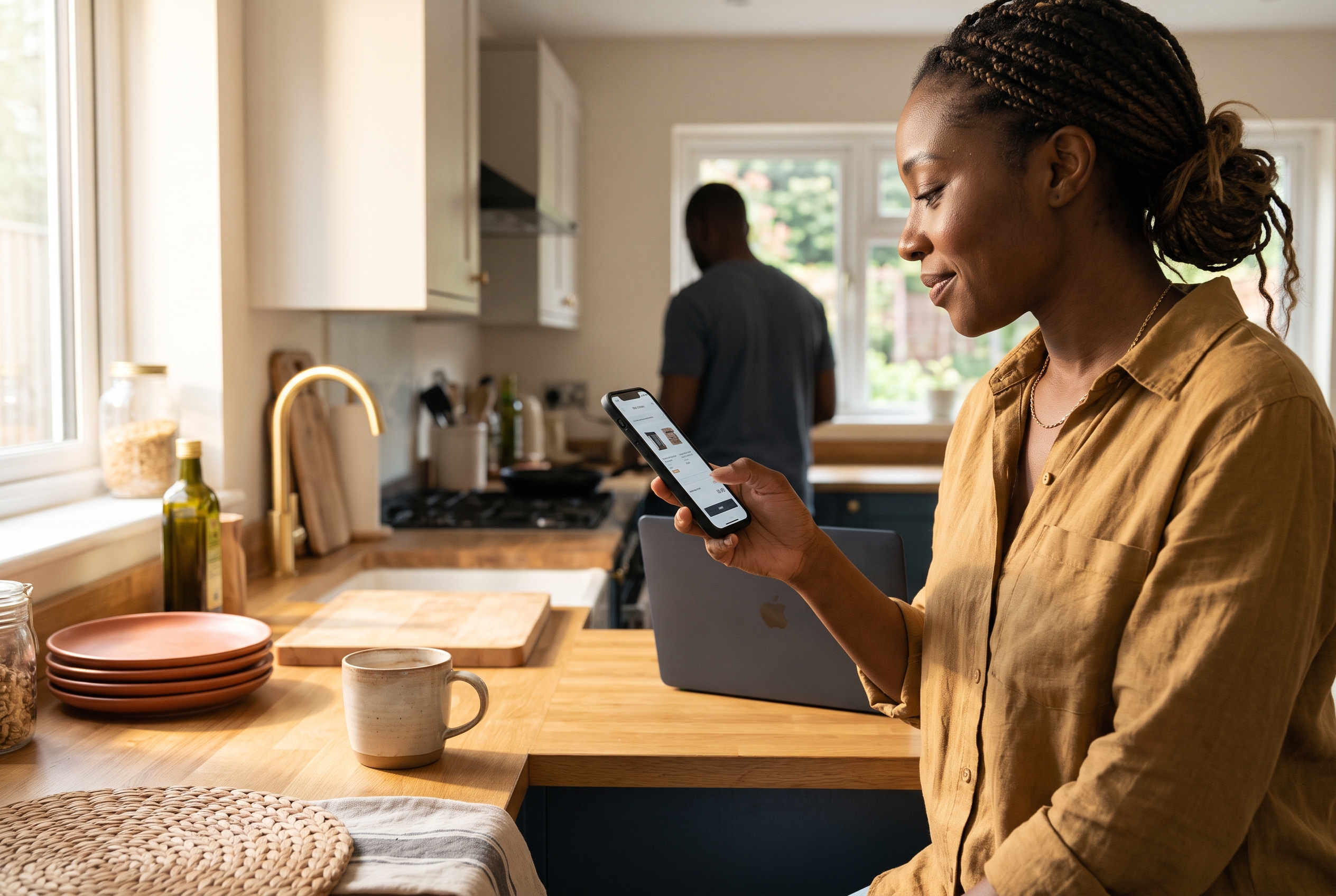
Most people hold a phone in one hand and tap with the thumb. Steven Hoober's well-known research on how people hold mobile devices found that the majority of touches happen in the lower-middle part of the screen. That's why add to cart button placement on mobile should favor the bottom third, not the top right where desktop habits put it.
A sticky bar puts the button exactly there, all the time. Shoppers read the description, check reviews, look at the size chart, and the button is still one tap away.
Sticky add to cart button best practices
| Element | Do this | Avoid this |
|---|---|---|
| Height | 48 to 56 px tall, full width or near full width | Slim bars that cover too little or too much of the screen |
| Trigger | Appear once the main button scrolls out of view | Showing it twice on the first screen |
| Content | Price, selected variant and a clear "Add to cart" label | Generic "Buy" with no price context |
| Variants | If none is selected, tapping scrolls to or opens the selector | Adding the wrong size by default |
| Contrast | One strong brand color, distinct from the page | Matching the background so it disappears |
| Overlap | Leave room for cookie banners and chat bubbles | Stacking the bar on top of other floating elements |
Two more details matter. First, show a quick confirmation after the tap, like a mini cart drawer or a button state change to "Added", so shoppers know it worked. Second, test it. Results vary: stores with long pages full of reviews and size charts have the most to gain, while stores whose button was already visible on a short page may see no change at all. Run it as an A/B test for two to four weeks, and measure add-to-cart rate and completed orders, not just clicks.
On most platforms, a sticky add to cart button means an app, a theme edit, or a developer. Rovela stores include it by default, so you can turn it on and ask the chat to adjust it, with no extra monthly bill.
Mobile UX Ecommerce Product Page Elements That Build Trust
On a phone, trust has to be visible without effort. Shoppers can't hover, compare tabs easily, or skim a wide page. Reviews, clear photos, honest shipping information and a visible return policy do the persuading for you.
Photos and video
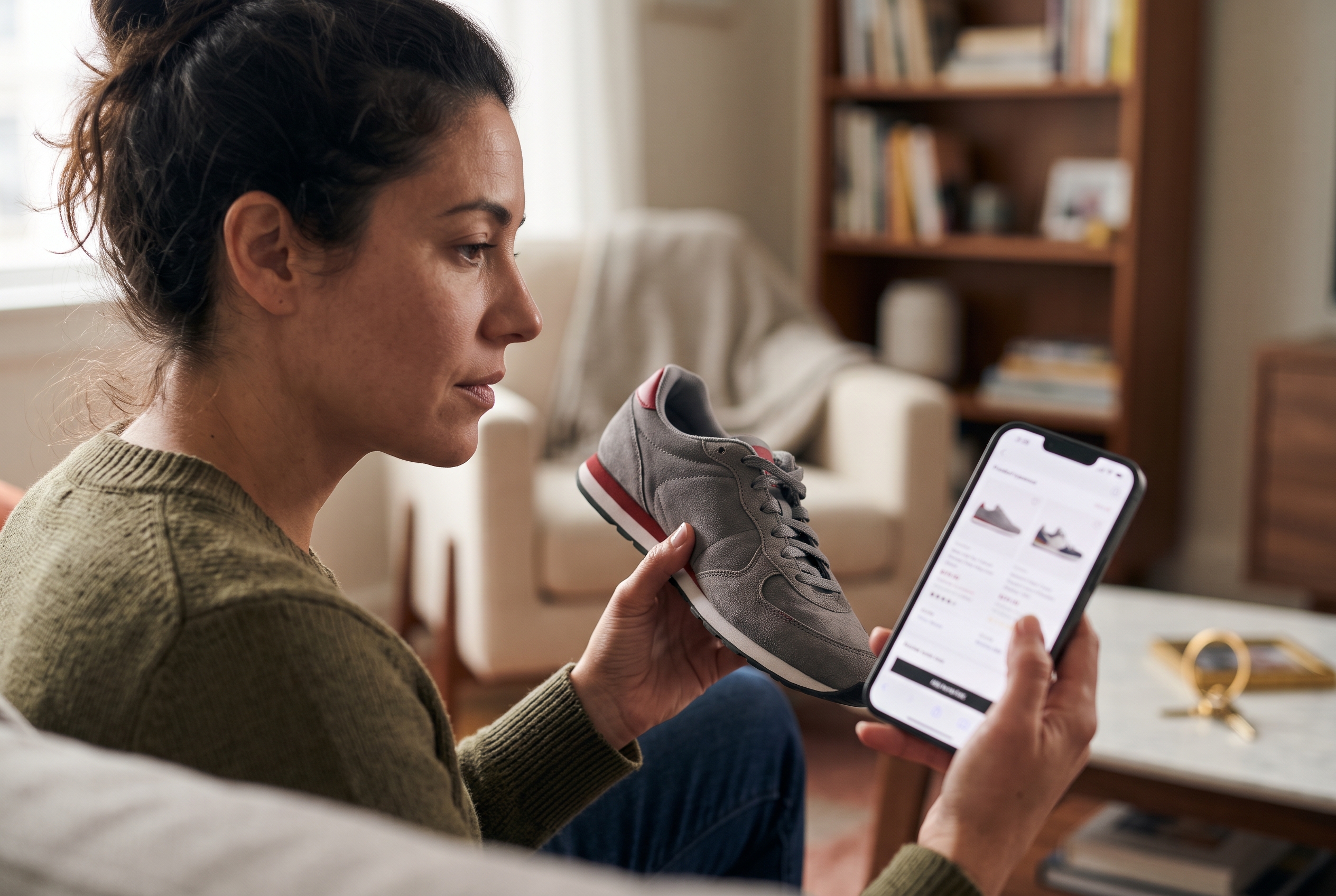
Photos do most of the selling. Use five to eight images per product: a clean front shot, detail close-ups, an in-use shot, a scale reference, and a lifestyle image. Add a short silent video, 5 to 15 seconds, for products where movement or texture matters. If you sell jewelry or similar detail-heavy goods, see our jewelry product photography guide for lighting and framing tips that apply to any small product.
Reviews and customer questions
Show the star average near the title and a short review snippet above the fold. Photo reviews work especially well on mobile because they act as proof and extra product images at once. Then handle objections before they become abandoned tabs: a question like "Does it fit true to size?" is a conversion killer if unanswered. Adding customer Q&A to product pages lets other buyers answer it for you. If you don't have reviews yet, our walkthrough on how to add product reviews to your online store covers setup and collection.
Ecommerce product page design tips for small screens
- Use short paragraphs and bullets. Three-line chunks beat a 300-word description block.
- Make tap targets at least 44 by 44 px. Apple's Human Interface Guidelines recommend 44 points, and Google's Material guidance recommends 48 dp.
- Show the size guide inline. A modal that works with one tap beats a link to another page.
- Put shipping cost and delivery date near the button. In Baymard Institute's checkout research, extra costs such as shipping, tax and fees were the most common reason for abandonment, cited by about 48% of shoppers.
- Offer express payment. Apple Pay, Google Pay and PayPal skip the typing. If you haven't set up PayPal, here's how to add PayPal to your online store.
Custom options without the clutter
If you sell personalized or configurable products, mobile is where option-heavy pages break. Keep each choice to one screen step, show a live preview, and update the price as options change. Our guide to adding custom product options shows how to structure them.
Increase Average Order Value on Mobile and Reduce Cart Abandonment
Conversion rate isn't the only lever. You can also raise revenue per visit by increasing average order value on mobile, and you can recover buyers who leave. Both work best when they happen without extra screens or pop-ups.
Increase average order value on mobile
- Bundles. "Complete the set" with a one-tap add under the main button.
- Free shipping threshold. Show a progress line in the cart: "You're $12 away from free shipping." Set the threshold about 20 to 30 percent above your current average order.
- Cross-sells in the cart drawer. Two small, relevant items, not a carousel of ten.
- Quantity breaks. "Buy 2, save 10%" works well for consumables.
Fix mobile cart abandonment
Baymard Institute's aggregated research puts average cart abandonment near 70 percent across ecommerce, and mobile usually runs higher. You won't get it to zero, but you can recover part of it.
- Offer guest checkout. No account wall before payment.
- Turn on abandoned cart emails and SMS. A sequence of two or three messages over 48 hours is typical. See these abandoned cart email examples for copy to start from.
- Save the cart across devices. Many shoppers add on a phone and finish on a laptop.
- Use a wishlist. Shoppers who aren't ready to buy can save the item instead of leaving.
Improve mobile checkout conversion
Product page gains vanish if checkout is painful. Enable autofill and address lookup, use numeric keypads for card and phone fields, show a progress indicator, and keep the total visible at every step. Our mobile checkout optimization guide has the full checklist.
A Simple Testing Plan for the Next 30 Days
You don't need to change everything at once. Change one thing at a time on your highest-traffic product pages, and judge results on orders, not impressions. A realistic plan looks like this:
| Week | Focus | Metric to watch |
|---|---|---|
| 1 | Image compression, remove unused scripts, fix layout shift | Mobile LCP and bounce rate |
| 2 | Sticky add to cart bar and button placement | Add-to-cart rate |
| 3 | Reviews near the title, delivery and returns line, accordions | Product page conversion |
| 4 | Express payment, guest checkout, abandoned cart flow | Checkout completion and recovered revenue |
Record a baseline before week 1: mobile conversion rate, add-to-cart rate, LCP and average order value. Without those four numbers you can't tell which change helped. Keep a simple log with the date of each change so a seasonal sales spike doesn't get credited to the wrong fix.
One caution: small stores often don't have enough traffic for clean A/B tests. If you get under a few thousand mobile sessions a month, compare before-and-after periods carefully and lean on best practices rather than chasing tiny differences. For more prompts to generate test ideas, see ChatGPT prompts for conversion rate optimization, and for the bigger picture, our piece on mobile conversion rate optimization.
Frequently Asked Questions
What is a good mobile conversion rate for ecommerce?
Most stores land between 1 and 3 percent on mobile, depending on category and traffic source. Higher-priced items convert lower, and repeat customers convert higher. Compare yourself to your own desktop and past performance first.
Does a sticky add to cart bar really help?
Usually, yes, especially on long pages with reviews, size charts and descriptions. It keeps the primary action in reach. Test it, because on short pages the gain can be small.
How many photos should a mobile product page have?
Five to eight is a solid range, plus a short video if the product benefits from it. Compress them so they don't slow the page.
Should I build a mobile app instead?
Not at first. A fast mobile site covers most of the opportunity, and apps make sense mainly for high-frequency repeat buyers. See our ecommerce mobile app development guide for the trade-offs.
Make Your Mobile Product Pages Work Harder
Raising mobile conversion comes down to a short list: load fast, show the essentials in the first screen, keep a sticky add to cart bar in the thumb zone, build trust with reviews and clear policies, and make checkout painless. Start with speed, then the button, then everything else.
If you'd rather not stitch this together from a theme and six paid apps, Rovela builds a complete store from a plain-language conversation, with sticky add to cart, reviews, Q&A, abandoned cart recovery and wishlist included on a single flat subscription. You can see what's included on the pricing page and have your first store live in hours.