By El Ghali Bennis · Published
How to Create Urgency on Product Page: Honest Tactics
Learn how to create urgency on product page with true low stock messages, smart thresholds and variant-level badges that lift conversions.

To create urgency on a product page, show shoppers a true, specific reason to buy now: a low stock message tied to real inventory ("Only 3 left"), a genuine sale deadline, or a restock warning. Place it near the add-to-cart button, trigger it at a sensible threshold, and never fake it.

Urgency works because people hate losing out. It also backfires fast when shoppers spot a bluff. This guide covers the difference between urgency and scarcity, the tactics that hold up, how to set a low stock threshold, how to handle variants, and where honest urgency turns into the fake kind.
What Does Urgency on a Product Page Actually Mean?
Urgency is a signal that the shopper should act soon. Scarcity is a signal that supply is limited. They overlap, but they aren't the same thing, and mixing them up leads to sloppy copy.
Urgency vs scarcity in ecommerce
Think of it this way. Scarcity is about quantity: "Only 4 left in stock." Urgency is about time: "Order within 2 hours for delivery Friday." Good scarcity marketing in ecommerce often creates urgency as a side effect, because limited stock implies the window to buy is closing.
| Type | What it signals | Example | Needs real data from |
|---|---|---|---|
| Scarcity (stock) | Limited quantity | "Only 3 left" | Live inventory |
| Scarcity (edition) | Limited run | "Batch of 200, no repeat" | Production plan |
| Urgency (deadline) | Offer ends | "Sale ends Sunday 11:59 pm" | Promotion schedule |
| Urgency (shipping) | Delivery cutoff | "Order in 1h 20m for same-day dispatch" | Carrier cutoff time |
| Social proof pressure | Others are buying | "12 sold in the last 24 hours" | Order data |
Every row depends on a fact you can verify. That's the test I'd apply to anything you put on a page: if a customer asked "is that true?", could you show them?
Why Honest Urgency Works (and When It Backfires)
Honest urgency works because it removes the "I'll think about it" gap that kills most sessions. It backfires when shoppers discover the message is a bluff, and they usually do.
Context matters. The Baymard Institute, which aggregates dozens of checkout studies, puts the average documented cart abandonment rate at roughly 70% (see its cart abandonment statistics, updated periodically), which means most people who show intent leave anyway. A true low stock message gives hesitant buyers a reason to close that gap. It won't rescue a weak product page, though. If photos are poor or the price is off, urgency just speeds up the exit.
Research on the effect itself is mixed, which is a good reason to test rather than assume. In "Dark Patterns at Scale" (Mathur et al., Princeton and University of Chicago, 2019), researchers crawled about 11,000 shopping sites and found 1,818 instances of dark patterns, with countdown timers and low stock messages among them. Some of the stock claims were randomly generated, and some countdown timers simply reset. The takeaway: shoppers are increasingly exposed to fake cues, so honest ones need to be specific to stand out.
The regulatory side is just as real. In the US, the Federal Trade Commission treats fake scarcity and false limited-time claims as deceptive under Section 5 of the FTC Act, and its work on "dark patterns" shows where enforcement attention sits. In the EU, the Unfair Commercial Practices Directive lists "falsely stating that a product will only be available for a very limited time" in its Annex I blacklist, which bans it outright. In the UK, the CMA has run investigations into pressure-selling cues such as misleading "only 1 left" and countdown claims. You can read the FTC's guidance at ftc.gov.
The fake urgency ecommerce checklist (what to avoid)
- Countdown timers that restart for every visitor or on page reload
- "Only X left" numbers that aren't connected to your inventory
- "Sale ends tonight" banners that run every night
- Made-up "people viewing now" counters
- Crossed-out "original" prices you never actually charged
Beyond legal risk, there's a trust cost. Shoppers who return after a fake "last chance" and see the same banner won't believe your next one, even when it's true.
How to Create Urgency on Product Page: 7 Tactics That Hold Up
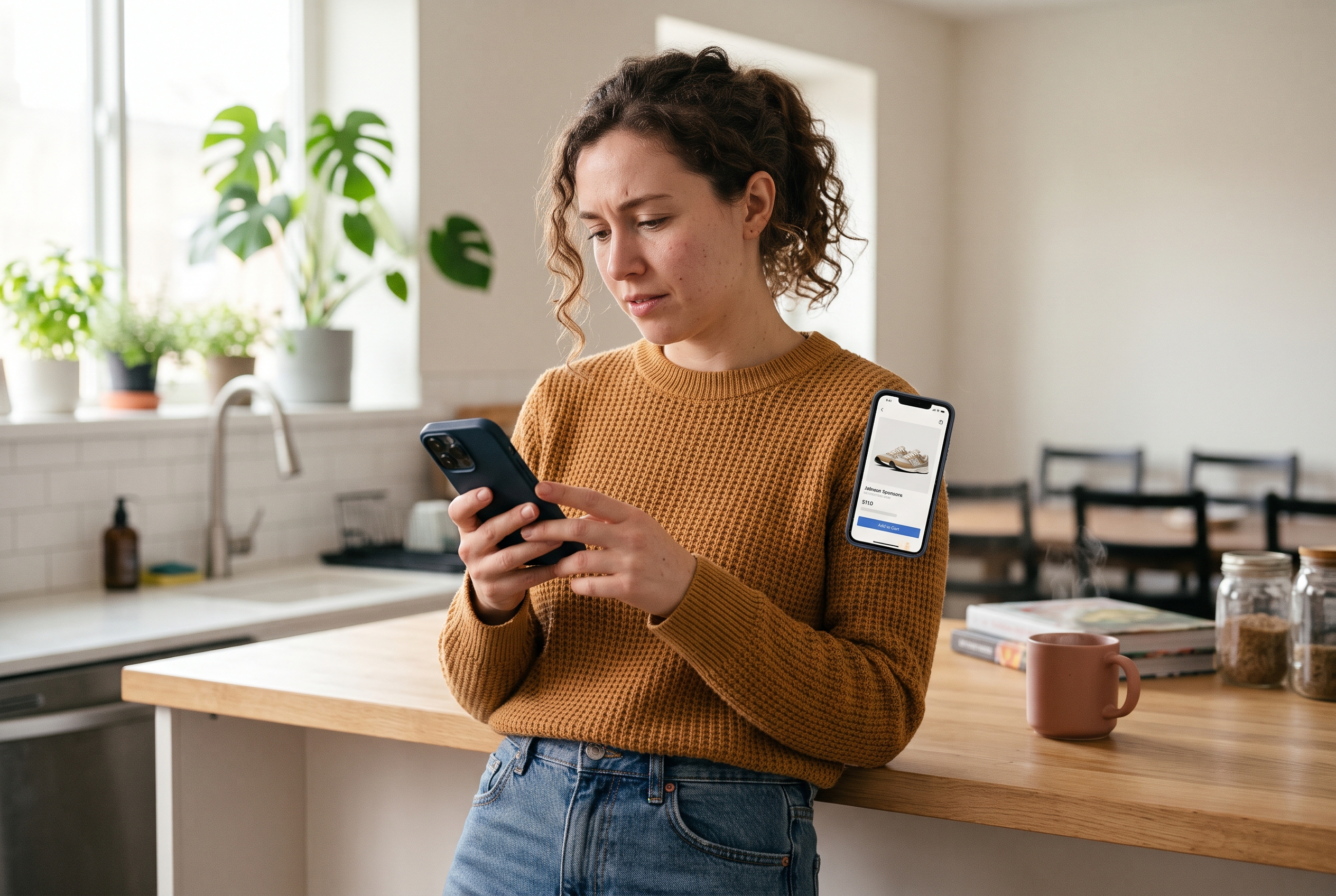
The best way to create urgency on a product page is to combine one or two honest signals, placed close to the buy button. Here are seven that work and stay truthful.
- Low stock message. A short line such as "Only 3 left" or "Low stock, order soon" under the price or above the button. This is the most effective single tactic when inventory really is thin.
- "Only X left" badge. A small visual tag on the product image and in collection grids. It catches attention before the shopper even opens the page.
- Delivery cutoff timer. "Order within 3h 10m for dispatch today." This one is true every day by nature, because the carrier pickup is real.
- Real sale deadline. A countdown that ends at a fixed date and time for everyone, then actually ends the price.
- Restock and back-in-stock notes. "Next batch arrives in 6 weeks" tells shoppers waiting is costly.
- Recent sales proof. "28 sold this week," pulled from real orders. It pairs well with product reviews on your store.
- Limited-edition framing. Numbered or seasonal runs where the cap is genuine and permanent.
Don't stack all seven. A page with a badge, a timer, a sales counter and a banner reads as desperate. Pick one primary signal and one supporting detail.
A worked example: one product, one signal
Picture a small candle shop with a hero scent that sells about 5 units a week. Before, the page shows nothing about stock. After, a plain "Only 8 left" line appears under the price once stock drops to 10, and a "Order by 3 pm for same-day dispatch" line sits beside the button. The shop owner runs it as a two-week test on that one product and compares add-to-cart rate, orders and refunds against the previous two weeks. The numbers here are illustrative, not a benchmark, but this is the shape of test that tells you whether your own audience responds. Treat any lift you read about elsewhere as a hypothesis, not a promise.
Where to place it
Put the message where the decision happens: directly under the price or between the variant selector and the add-to-cart button. Use a contrasting but calm color (amber works better than alarm red for most brands). Keep copy under eight words. For layout inspiration, look at product page examples from brands that convert, and notice how few of them shout.
How to Show Remaining Stock on a Product Page
To show remaining stock on a product page, connect a message to your live inventory count and display it only when stock drops below a set threshold. Showing "1,240 in stock" does nothing for urgency. Showing "Only 4 left" does.
Set a low stock threshold that fits your business
A low stock threshold in ecommerce is the quantity at which the message switches on. Too high and the badge appears everywhere, so it means nothing. Too low and most shoppers never see it. A sound starting point comes from standard reorder-point logic: your threshold should roughly equal the units you sell during your restock lead time, plus a small safety buffer. That way the message appears while you can still reorder.
- Look at your average weekly sales for the product.
- Multiply by your restock lead time in weeks, then add a buffer of one week's sales.
- Round to a clean number and cap it at about 10 for most catalogs, so the message stays rare enough to mean something.
A candle shop selling 5 units a week with a one-week restock might trigger at 10. A furniture brand selling 2 a month might trigger at 3. If your supplier takes four weeks to restock, raise the trigger accordingly, then check the result against your own sales data. Review thresholds each quarter, since sales velocity shifts.
Choose the right format: message, badge or counter
| Format | Best for | Watch out for |
|---|---|---|
| Text low stock message | Product page, near the button | Easy to miss if styled too quietly |
| "Only X left" badge | Collection grids and images | Clutter if many products trigger at once |
| Stock counter for online store | Bar or number showing units left | Looks gimmicky on high-volume items |
| Low stock notification product page (email/alert) | Waitlists and back-in-stock | Needs consent and accurate timing |
Text messages tend to be the safest choice for premium brands. Progress-bar counters suit flash sales and drops.
Variant inventory display: show stock per size and color
Variant inventory display matters more than most merchants realize. A hoodie might have 200 units overall but only 2 in medium black. If your message reads from total stock, it never fires for the size the shopper wants. If it reads per variant, it fires at the right moment.
- Update the message when the shopper selects a size or color ("Only 2 left in M / Black").
- Mark sold-out variants clearly, but keep them selectable with a "notify me" option.
- Show color swatch availability on listings; see how to show color swatches on a product listing page.
Size-driven scarcity also ties to returns. If your medium sells out because people guess sizes, a clear size chart protects both conversion and margin.

Low Stock Message Copy: Examples You Can Adapt
Good low stock message copy is short, specific and calm. It states a fact, then lets the shopper decide. Here are patterns that work across categories.
- Exact count: "Only 3 left" (clearest and most credible)
- Variant-specific: "Only 2 left in size M"
- Soft threshold: "Selling fast, under 10 left"
- Restock info: "Low stock. Next shipment arrives March 12"
- Delivery tie-in: "Only 5 left. Order by 4 pm for same-day dispatch"
- Cart reminder: "Items in your cart are selling fast"
Avoid vague hype like "HURRY!!!" or "Almost gone!!" with no number. Specific facts beat adjectives. Compare "Only 3 left" with "Don't miss out!" and ask which one you'd believe.
Tone by category
Fashion and beauty can handle "Selling fast." Handmade goods suit "Only 2 made this month." Electronics and tools do better with a plain count and a delivery cutoff, because buyers there want facts. Luxury brands often skip counters entirely and use "Limited edition of 100" instead.
How to Test Urgency on Product Page Messages and Increase Conversions
Run an A/B test on one product group for at least two full weeks and measure add-to-cart rate, conversion rate and return rate. Don't judge on clicks alone. Urgency should lift purchases without lifting returns or complaints. Two weeks covers at least two full weekday and weekend cycles, which smooths out the swings in shopping behavior. Low-traffic stores may need longer to reach a reliable result.
These ecommerce conversion rate tips keep the test clean:
- Test one variable. Message vs no message first. Then wording, then placement.
- Segment by traffic. Returning customers and cold ads respond differently. Cold traffic often reacts more to scarcity.
- Watch mobile separately. The message must sit above the fold near the button on a phone screen.
- Track the downstream. Check refund rate and customer support tickets. A spike signals shoppers felt pressured.
- Retire what fades. If a badge has been on a product for months, it's become wallpaper. Remove it or tie it back to real stock movement.
To increase product page conversions beyond urgency, fix the basics first: sharp images, clear copy, trust signals and social proof. Our guide on adding customer Q&A to product pages shows how answering objections removes friction that no badge can solve. Google's own product structured data documentation is also worth a read, since availability markup ("InStock," "LimitedAvailability") keeps your search listing consistent with what's on the page.
Common questions
Does urgency hurt SEO? No. Messages are page content, not ranking factors. Just keep availability schema accurate.
Is a low stock message legal? Yes, when the number is true. Misleading scarcity claims are the problem, not the message itself.
Should I show stock on every product? No. Only below your threshold. Constant badges lose power.
What about dropshipping or print on demand? If you don't hold stock, don't show stock counts. Use delivery cutoffs or true sale deadlines instead.
Set Up Urgency on Product Page Once and Let Inventory Drive It
The cleanest setup ties every message to live data: inventory for low stock, the calendar for sale deadlines, the carrier schedule for shipping cutoffs. Then nothing needs manual editing, and nothing can drift into fake territory.
On many platforms that means installing a separate app for each piece and paying monthly for it. Rovela builds stock urgency badges, variant-level inventory display and thresholds into the store by default, so the message reads from your real stock with no plugin stack. You can set it by telling the chat what you want, such as "show 'Only X left' when a variant drops below 5." Check the pricing page to see what's included in the flat subscription.
Honest urgency is simple: tell the truth, say it clearly, show it where the buying decision happens. Start with one product, one threshold and one message, then measure. If you want a store where this is ready out of the box, try Rovela and describe your shop in plain words.