By El Ghali Bennis · Published
Welcome Popup Discount Guide: Offers, Timing, Benchmarks
Build your email list with a welcome popup discount. See offers, timing, copy examples, mobile rules, and realistic conversion benchmarks.

A welcome popup discount is a small overlay that offers first-time visitors a reward, usually 10% off or free shipping, in exchange for their email address. Done well, it turns anonymous traffic into a list you own. Most stores see single-digit capture rates, so offer, timing, and copy decide everything.

Here's the short version before we go deeper. Show the popup after 5 to 10 seconds or around 30% scroll depth, not instantly. Offer something concrete. Ask for the email only, with phone number as an optional second step. Make the close button obvious on mobile. And deliver the code automatically, so nobody has to copy and paste anything at checkout.
This guide covers how welcome popups work, which offers pay back, how to time them, what to write, how to A/B test, what to put in the welcome emails, and what conversion rate you should expect. It's written for store owners who want to build an email list for an online store without annoying the people they're trying to win.
What Is a Welcome Popup Discount and Does It Work?
A welcome popup discount is an on-site offer shown to a first-time visitor that trades a coupon for an email address. It works because the visitor is at peak curiosity and you have one realistic chance to start a relationship before they leave.
Here's the math operators care about. Most visitors never come back. Baymard Institute's cart abandonment statistics, which aggregate dozens of studies, put the average documented abandonment rate near 70%, and browsing visitors who never reach a cart leave at even higher rates. If you don't capture an email on the first visit, you've paid for that traffic once and can't reach it again. A discount popup for first-time visitors gives you a second shot through email.
A simple example shows the stakes. Say your store gets 10,000 visitors a month. At a 1.5% capture rate you add 150 subscribers. At 3.5% you add 350. If 8% of subscribers buy from the welcome sequence at a $45 average order, that's roughly $540 versus $1,260 in first-order revenue per month from the same traffic. These figures are illustrative, not a forecast, but the gap is why tuning matters.
The honest downsides exist too. Popups can irritate visitors, cheapen your brand if overused, and attract coupon hunters who never buy at full price. That's why the details below matter more than the decision to run one at all.
The two jobs a welcome popup does
- Capture: collect an email (and consent) so you can market to the visitor later.
- Convert: nudge a hesitant first-time buyer into a first order discount email signup flow that ends in a purchase.
Treat the second job as seriously as the first. A list of 5,000 emails that never receives a decent welcome sequence is just a database. The popup is the front door; the automated emails behind it produce the revenue.
Welcome Popup Discount Examples and Offer Ideas That Convert
The best welcome offer is the smallest incentive that still feels worth an email address. For most stores that's 10% off, free shipping, or a gift with first purchase. Match the offer to your margins and your average order value, not to what competitors shout.
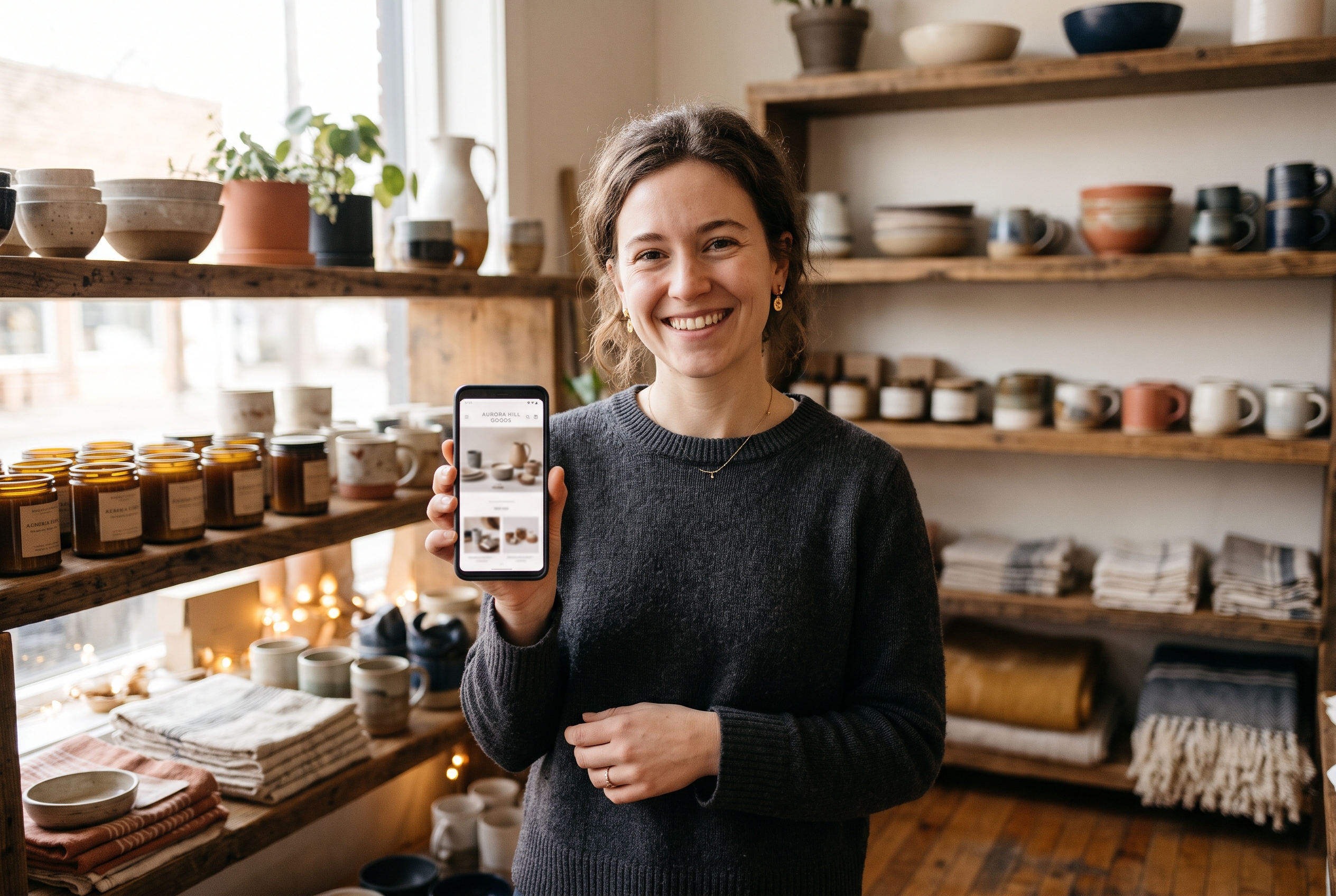
Welcome offer ideas for an online store
Here are the offers worth testing, with the situation where each fits:
| Offer | Best for | Watch out for |
|---|---|---|
| 10% off first order | Margins above 40%, mixed catalogs | Coupon hunters who never return at full price |
| $10 off $60+ | Stores wanting a higher order value | Threshold set too high feels like a trap |
| Free shipping on first order | Heavy or low-priced items, where shipping costs are the objection | Margin hit on very small orders |
| Free gift with purchase | Beauty, food, accessories | Inventory tracking for the gift |
| Entry into a monthly giveaway | Premium brands avoiding discounts | Low purchase intent among entrants |
| Early access to drops | Fashion, limited runs, collectibles | Needs a real release calendar |
| Quiz result plus code | Skincare, supplements, apparel fit | Longer setup time |
Percentage versus dollar discounts is a real decision. Percentages feel bigger on low-priced items. Dollar amounts feel bigger on items above about $100. If your average order is $45, "$10 off" reads as more than "10% off" even though you'd give away $4.50 with the percentage. Test both.
Welcome popup examples by store type
- Pet supplies: "Get 10% off your first order, plus a free treat sample." Pet owners respond to a physical gift. If you sell in that niche, see our guide on how to sell pet products online.
- Home decor: "Free shipping on your first order over $75." Bulky items make shipping the main objection. Our home decor online store builder guide covers the platform side.
- Fitness gear: "Join the list, get $15 off $100 and a starter workout plan." Content as part of the offer lifts perceived value. See the fitness ecommerce website builder comparison for setup options.
- Digital products: "Download the free template pack, and get 15% off your first purchase." No shipping cost means you can afford a bigger discount. More in how to create a website to sell digital products.
Welcome Popup Timing Best Practices
The right moment is 5 to 10 seconds after arrival, or when the visitor scrolls roughly 25 to 40% down the page. Instant popups interrupt people before they know what you sell. Late popups miss them entirely. Test inside that window and let your own data pick the winner.

Exit intent vs welcome popup
An exit intent vs welcome popup comparison comes down to what you interrupt. A welcome popup appears while the visitor is browsing. An exit-intent popup fires when the cursor heads for the browser's close or back button. Exit intent interrupts nothing, so it annoys fewer people, but it doesn't work on mobile in the same way because there's no cursor.
| Factor | Timed welcome popup | Exit-intent popup |
|---|---|---|
| Trigger | Time on page or scroll depth | Cursor leaves the window (desktop); scroll-up or back button (mobile) |
| Interruption | Higher | Lower |
| Typical use | First-visit list building | Last-chance save for leaving visitors |
| Risk | Annoying engaged browsers | Catches only people already leaving |
My recommendation: run a timed welcome popup with the main offer, then use exit intent as a softer second attempt only for people who dismissed the first one, perhaps with a lighter "Just want updates? Join the list" message and no discount. Don't stack two full-price-cutting offers. Shoppers notice.
Rules for when not to show it
- Don't show it on the checkout page. You'll distract buyers who are already paying.
- Don't show it to existing subscribers or returning customers. Suppress it with a cookie or customer login.
- Don't re-trigger after a dismissal for at least 7 days.
- Don't fire it over a cookie banner. Stack them in sequence, consent first.
How to A/B test your welcome popup
Testing is how you move from the default range to the tuned one. Follow a simple method:
- Change one variable at a time. Offer, headline, delay, or image. If you change two, you won't know which one worked.
- Split traffic evenly between the control and the variant, and run both at the same time, not one after the other.
- Wait for enough data. Aim for at least a few hundred visitors per variant and a minimum of two full weeks, so weekday and weekend behavior both show up. Small stores with low traffic should test bigger changes, like 10% off versus free shipping, because small tweaks won't show a clear winner.
- Judge by revenue, not signups alone. A richer offer can raise signups while lowering profit per subscriber. Compare first-order revenue per visitor.
- Keep a log. Write down what you tested, the dates, and the result, so you don't repeat old experiments.
A good first test order: offer type, then delay (5 seconds versus scroll-triggered), then headline, then image.
Newsletter Popup Copy Examples and Design Rules
Good popup copy states the reward, the action, and the time cost in under 20 words. Skip vague lines like "Join our newsletter." Say what the visitor gets and when they get it. Specific beats clever almost every time.
Newsletter popup copy examples
Here are headline and button pairs you can adapt:
- Headline: "Take 10% off your first order." Button: "Send my code."
- Headline: "Your first order ships free." Button: "Claim free shipping."
- Headline: "New here? Here's $10 toward your first pick." Button: "Get my $10."
- Headline: "Get first dibs on new drops." Button: "Put me on the list."
- Decline link: "No thanks, I'll pay full price" is pushy shaming. Use "Maybe later" or "Close" instead.
First-person button text ("Send my code") is a common hypothesis in conversion testing because it reads as the visitor's own decision. Results vary by audience, so treat it as a cheap test rather than a rule.
Email capture popup best practices
- Ask for one field. Email only. Every extra field tends to cut completion.
- Add SMS as step two. After the email, offer a phone field for text alerts. Don't make it required.
- Include consent language. If you sell to the EU or UK, GDPR requires clear opt-in. Check the official GDPR consent requirements page and ask your lawyer about your specific setup.
- Show the rules. "One use per customer, minimum $40" belongs in small print, not hidden.
- Use a real product image. Test a photo of your best seller against a stock graphic. Real product photos usually build more trust, but your audience decides.
- Add a clear close button. Hiding it frustrates visitors and can put you on the wrong side of Google's interstitial guidance.
Mobile popup best practices
Mobile traffic is the majority of visits for most stores, and mobile is where popups get punished. Google's guidance on intrusive interstitials warns against overlays that cover the main content right after a visitor arrives from search.
- Use a bottom banner or a slide-in that covers less than 30% of the screen.
- Make the close target at least 44 by 44 points, per Apple's Human Interface Guidelines.
- Trigger on scroll or after a page or two, not on landing.
- Pick the keyboard type automatically (email keyboard) so typing takes seconds.
- Test on a real phone, not a desktop browser resized to look small.
Email Popup Conversion Rate: What to Expect
A typical email popup conversion rate sits in the low single digits, and strong ones reach 5 to 10%. Klaviyo has published analyses of signup form performance in its signup form benchmarks, with averages in the low single digits and top performers well above that. Numbers shift each time they're updated and vary by industry and traffic source, so check the latest figures.

Email capture rate benchmark by situation
| Situation | Reasonable capture rate |
|---|---|
| Untested default popup | 1 to 3% |
| Tuned offer, timing, and copy | 3 to 6% |
| Strong brand with a loyal audience | 6 to 10%+ |
| Mobile with a poorly sized popup | Often under 2% |
These ranges are rules of thumb synthesized from published vendor benchmarks like Klaviyo's and common operator experience, not audited figures. Treat them as ranges to sanity-check against, not promises. Your own baseline matters more than anyone's average. If you're at 1.5% today, getting to 3% doubles your list growth without a cent more in ad spend.
How to get more email subscribers in ecommerce
The popup is one lever. Combine it with a few others to compound results:
- Add an inline signup in the footer and on blog posts for visitors who hate popups.
- Offer a lead magnet on content pages, such as a size guide or buying checklist.
- Collect emails at checkout with an unticked marketing consent box, which is the safer default under GDPR-style rules.
- Run a giveaway once or twice a year with a clear prize and clean entry rules.
- Segment the first-visit audience. Different offers for different collections beat one generic offer.
How to Set Up and Deliver a Welcome Popup Discount
Setting one up takes four steps: pick the offer, build the popup, connect the code, and write the welcome email sequence. The step most stores botch is delivery. Make the code apply itself, because every manual copy-and-paste step loses buyers.
Step by step
- Do the margin math. If your gross margin is 50% and you give 10% off, you still keep 40% on that first order. Add the cost of shipping before you decide on free shipping.
- Create a single-use or customer-limited code. Unlimited public codes end up on coupon sites within weeks.
- Build the popup. One headline, one field, one button, one close option.
- Apply the discount code at checkout automatically. Pass the code through the link in the confirmation email, or store it in the visitor's session so it's already applied at checkout.
- Send a three-email welcome sequence. Details below.
- Measure and iterate. Track signup rate, code redemption rate, and first-order revenue per subscriber, not just list size.
What to put in your welcome email sequence
The sequence is where the discount turns into revenue. Here's a structure you can copy:
- Email 1, sent immediately: Deliver the code with a one-click button that applies it. Subject line example: "Your 10% off code is inside." Add three best sellers below the button and state the expiry date.
- Email 2, two days later: Tell your story in a few short paragraphs. Why you started, what makes the product different, and a customer review or two. No hard sell, just a link to your best seller.
- Email 3, day five: Remind them the code expires soon. Subject line example: "Your code ends tomorrow." Address the usual objections, such as shipping times, returns, and sizing, in two or three lines.
- Optional email 4, day nine: For non-buyers, send a no-discount email with a helpful guide or FAQ, then move them into your regular newsletter.
Track opens, clicks, and redemptions per email. If email 1 has strong opens but weak clicks, rework the button and product picks. If email 3 drives most redemptions, move your expiry window earlier.
Common mistakes to avoid
- Training customers to wait. If your popup also appears on every sale page, shoppers learn to hold off. Keep the welcome offer for new visitors only.
- Offering too much. A 25% welcome code on a 35% margin product is an expensive way to get an email.
- Ignoring the second email. The code email gets opened by most subscribers; the follow-up is where you earn the repeat buyer.
- Forgetting existing customers. Exclude them from the popup, or they'll feel like new customers get a better deal.
The practical stack matters here too. On many platforms, popups, abandoned cart emails, and discount logic come from separate paid apps, each adding monthly cost and page weight. Our breakdown of Shopify alternatives shows how that app stack adds up, and the AI in ecommerce guide covers how automation can take the repetitive parts off your plate.
Wrapping Up: Build the List, Then Earn the Sale
A welcome popup discount works when the offer fits your margins, the timing respects the visitor, the copy is specific, and the code applies itself. Start with 10% off or free shipping, trigger at 5 to 10 seconds, keep it to one field, and judge success by first-order revenue per subscriber. Then test one variable at a time for 30 days.
If you'd rather not assemble popups, discount logic, and welcome emails from separate paid plugins, Rovela builds them into your store from the start, along with abandoned cart recovery and marketing automations, on one flat subscription. You describe what you want in plain words, and the AI sets it up. See Rovela's pricing or the guide to adding products to your online store to get your catalog ready before your popup goes live.