By El Ghali Bennis · Published
Trust Badges for Online Store: What Converts and Where
Which trust badges for an online store actually lift checkout completion, where to place them, and which to skip. Start with three that are honest.
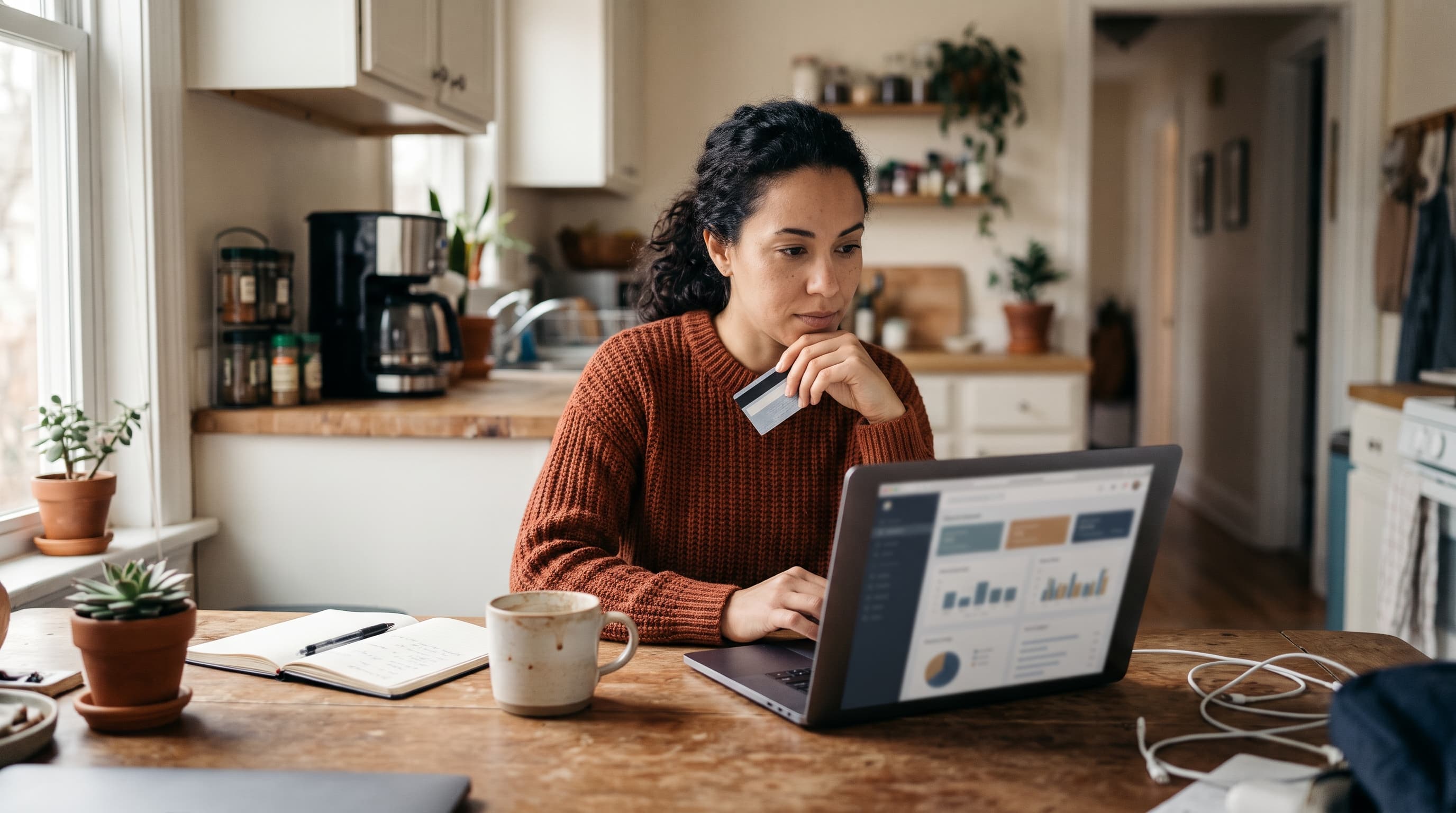
Trust badges for an online store are small visual signals, like a secure checkout lock, payment logos, or a money-back guarantee seal, that reassure shoppers their data and money are safe. They work best at the moment of doubt: near the price, the cart, and the payment fields. Used honestly and sparingly, they can reduce abandonment.
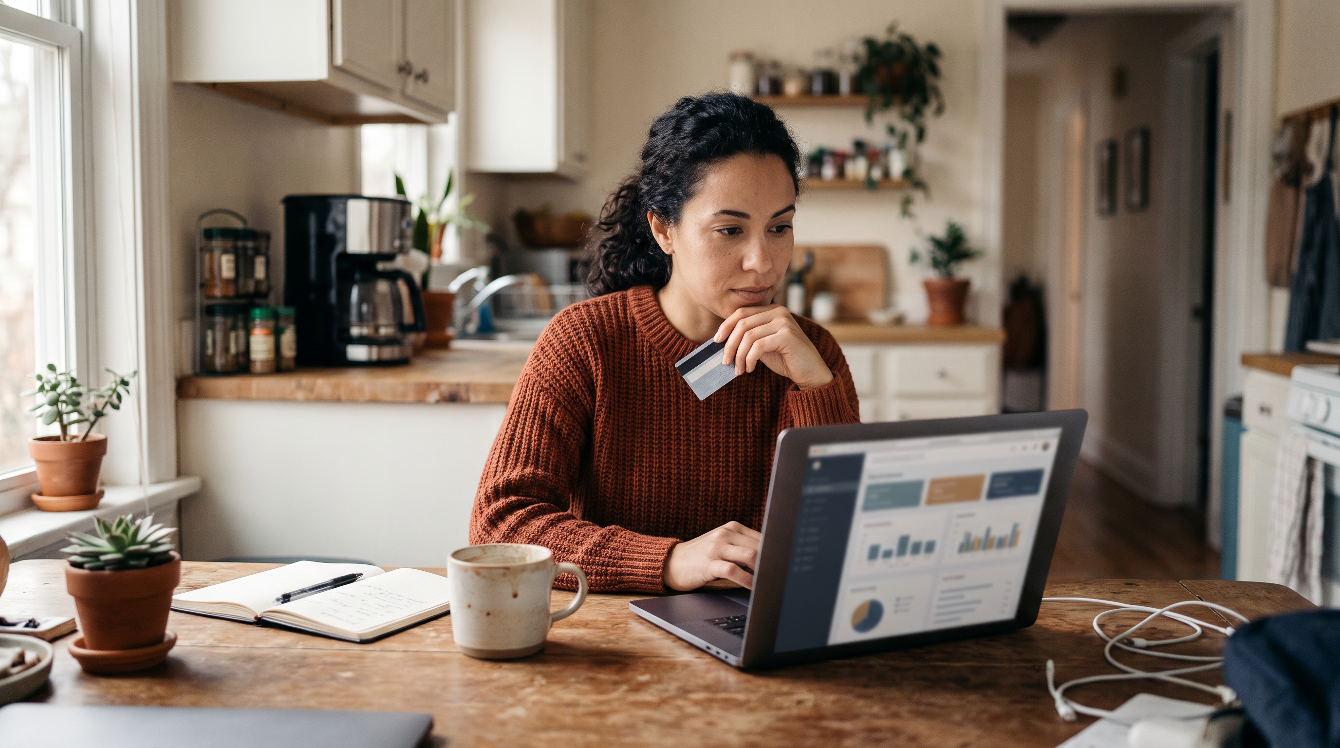
That's the short answer. The longer one is more interesting, because most stores get trust badges wrong. They pile ten logos in the footer, use badges nobody recognizes, or claim protections they don't offer. This guide covers which badges are worth showing, where to place them, what the evidence says, and how to build a trust layer that doesn't slow your store down.
Do Trust Badges Increase Conversions?
Sometimes, yes, but not magically. Trust badges increase conversions when they answer a specific worry a shopper has at that exact moment. Decorative badges that answer nothing do little, and badges that look fake can hurt.
The strongest public data point comes from the Baymard Institute's cart abandonment research. Its checkout survey found that 19% of US online shoppers had abandoned an order because they didn't trust the site with their credit card information. That's nearly one in five people who were ready to buy. Baymard's aggregated figure for average documented cart abandonment is about 70%, so even a small recovery of that trust gap is meaningful. Treat these as survey-based benchmarks rather than guarantees: the percentages come from self-reported behavior, and Baymard updates its figures periodically, so check the page for the latest numbers.
Here's the nuance operators learn quickly. Baymard's usability testing has also found that shoppers often trust a badge based on whether they recognize the brand behind it, not on the badge itself. A familiar payment logo such as Visa, Mastercard, PayPal, or Stripe carries real weight. An unknown "100% Secure" seal you made in a free design tool carries none.
Public A/B test results are mixed, which is the honest picture. Some published tests show lifts after adding a security seal near the payment fields, while others show no measurable change or even a dip when generic seals were added. Practitioners such as CXL have written about this inconsistency, and the pattern is consistent: the effect depends on the store's brand recognition, the audience, and where the badge sits. That is why you should measure your own results.
What the evidence suggests
- Recognizable beats generic. Payment brand logos and well-known security marks outperform invented seals.
- Placement beats quantity. One badge next to the pay button does more than six in the footer.
- Newer stores gain more. If shoppers have never heard of you, reassurance matters. Established brands lean on reputation instead.
- Test it yourself. Run an A/B test for two to four weeks, and keep the sample meaningful: a handful of orders can't tell you anything. Your audience may differ from the averages.
So the honest answer to "do trust badges increase conversions" is: they can, if they're real, recognizable, and placed where doubt peaks. If you want the wider picture of the platform choices that sit underneath any badge, our guide to choosing an ecommerce platform as a beginner covers which checkouts ship with trust features built in.
The Best Trust Badges for Ecommerce
The best trust badges for ecommerce fall into four groups: security, payment, policy, and social proof. You don't need all of them. Pick the ones that match your real operations and your customers' biggest fears.

Security badges and the SSL badge for your website
An SSL certificate encrypts data between your shopper's browser and your store. Browsers already show a padlock for it, and Google Chrome flags sites without HTTPS as "Not secure." That means the SSL badge for a website is less about the certificate and more about saying it out loud near the payment form: "Your payment is encrypted."
Third-party scanner seals, such as those from Norton or McAfee, exist too. They cost money and their impact is debated. If you're on Stripe, you already get PCI-compliant payment handling, which is a stronger story than a paid seal. Say so plainly: "Payments processed securely by Stripe."
How to get and verify third-party seals
Real seals are earned, not downloaded. The usual process looks like this:
- Apply with the provider. Security scanners and membership programs ask for your domain and business details, and many run a scan or review before issuing a seal.
- Use their official embed. Genuine seals typically link to a verification page on the provider's own domain, showing your business name and current status.
- Click your own badge. If it doesn't open a live verification page, shoppers who click will notice.
- Keep it current. Seals expire or get revoked. Put renewal dates in your calendar and remove a badge the day it lapses.
Be careful with Better Business Bureau marks too: use the one tied to your actual accreditation, and don't copy a rating image you don't hold.
Secure checkout badge and payment logos
A secure checkout badge is usually a padlock icon with short text like "Secure checkout" or "256-bit encryption." Pair it with the logos of the cards and wallets you accept: Visa, Mastercard, American Express, PayPal, Apple Pay, Google Pay. Shoppers scan for their own payment method. If they can't see it, they wonder if they can pay at all.
Money back guarantee badge
A money back guarantee badge targets the fear of being stuck with something you don't want. It only works if the policy is real and easy to find. "30-day money-back guarantee" with a link to the actual terms beats a vague "Satisfaction guaranteed." Longer windows signal confidence, but check what your margins can handle first.
Free shipping badge
A free shipping badge isn't strictly a trust badge, but it removes a different doubt: surprise costs. Baymard's checkout survey lists extra costs such as shipping, tax, and fees as the top reason shoppers abandon carts, cited by about 48% of respondents. State your threshold clearly, such as "Free shipping over $50," and show it on product pages and in the cart, not only at checkout.
Social proof and brand-based signals
- Review stars: Show your average rating and count. "4.8 from 1,200 reviews" is concrete.
- Customer Q&A: Real answers from real buyers reduce pre-purchase anxiety.
- Press or marketplace mentions: Only if they're genuine and verifiable.
- Business details: Address, phone number, and a named contact build credibility no badge can fake.
- Industry memberships: Better Business Bureau accreditation or a trade association logo, only if you actually hold it.
Accessibility and alt text for badges
Badges are images, so they need to work for everyone, including shoppers using screen readers. Write alt text that states the claim, such as alt="Secure checkout, payments encrypted" or alt="30-day money-back guarantee", rather than "badge.png" or a stuffed keyword. If a badge is purely decorative next to text that already says the same thing, use an empty alt attribute so it isn't read twice. Make sure linked badges have clear link text or alt text describing where they go, and check that text inside badge images has enough contrast against its background. Better still, use real text beside a small icon: it stays sharp on every screen, is easy to translate, and loads faster than a large image.
Where to Place Trust Badges for Maximum Effect
Place trust badges where shoppers hesitate: beside the price on product pages, in the cart summary, and directly beside the payment fields at checkout. Spread across the whole site, they become wallpaper. Concentrated at decision points, they work.

| Location | Best badge types | Shopper worry it answers |
|---|---|---|
| Homepage header or hero | Free shipping, returns window, review rating | "Is this store legit?" |
| Product page (near Add to cart) | Money-back guarantee, free shipping, review stars | "What if it's wrong for me?" |
| Cart page | Payment logos, shipping threshold, returns policy link | "Any hidden costs?" |
| Checkout page, beside payment fields | Secure checkout badge, SSL message, payment processor | "Is my card safe here?" |
| Footer | Payment logos, contact details, policy links | "Is there a real business behind this?" |
Trust badges for the checkout page
This is where badges earn their keep. Put your trust badges for the checkout page immediately next to the card fields and the final "Place order" button, not in a distant sidebar. Keep it to two or three: a secure checkout message, accepted payment logos, and your guarantee. Anything more distracts from finishing the order.
On mobile, which is where most traffic lands, a single compact row under the pay button is enough. Large badge images push the button below the fold, and that costs more than the badge gains.
Footer trust badges
Footer trust badges are the safe, low-effort option. Shoppers who are suspicious scroll down looking for a contact address, policies, and payment logos. Put those there. But don't rely on the footer alone, because most buyers never reach it during checkout.
How to Increase Trust on an Ecommerce Website Beyond Badges
To increase trust on an ecommerce website, combine badges with proof that can't be faked: clear policies, real reviews, fast pages, and visible contact options. Badges are the label; these are the product.
Think of trust signals for an online store as a stack. Badges are the top layer. Underneath sit the things shoppers actually judge:
- Speed. A slow, janky page feels unsafe. Google's mobile speed research found that the probability of a visitor bouncing rises 32% as load time goes from one second to three seconds, and 90% from one to five seconds.
- Clear policies. Shipping times, returns, and privacy terms written in plain language, linked from the footer and cart.
- Real reviews with photos. Mixed reviews are more believable than a wall of five stars.
- Visible contact. Email, a phone number if you have one, and a response time promise.
- Consistent design. Broken layouts, mismatched fonts, and low-quality images undercut every badge you add.
- Legitimate business basics. If you're unsure about registration, our guide on whether you need a business license to sell online is a good starting point.
This is also why stacking apps for each trust feature can backfire. Every extra plugin adds scripts, and scripts slow pages. Rovela's own internal tracking of Shopify stores suggests most run several apps each, and every one is another thing to maintain and another source of delay. Our WooCommerce maintenance cost breakdown shows how this plugin overhead adds up over time.
How trust ties to cart abandonment
If you want to reduce cart abandonment through trust, map your abandonment reasons first. Baymard's research lists the main culprits: extra costs, forced account creation, slow delivery, confusing checkout, and distrust with card details. Only one of those is solved by a security badge. The rest need clear shipping costs, guest checkout, and a simple flow. Badges patch the trust problem; design fixes the others.
Mistakes That Make Trust Badges Backfire
Trust badges backfire when they're fake, cluttered, or inconsistent with your actual practices. Shoppers have seen enough scam sites to spot a badge that was just pasted in.
- Claiming protections you don't have. A "Verified by" seal without verification is a legal risk, and in some regions a consumer protection issue. Check the US Federal Trade Commission guidance at ftc.gov on deceptive claims.
- Too many badges. Eight logos in a row look desperate. Three well-chosen ones look confident.
- Low-resolution or mismatched images. Blurry badges signal carelessness.
- Badges with no link. A guarantee badge should open the policy. A dead badge raises suspicion.
- Heavy third-party scripts. Some seal providers load external code that slows checkout. Use lightweight images or inline icons when possible.
- Ignoring mobile. Check every badge on a real phone, not just a desktop preview.
A simple five-step setup
- List your real assurances. Secure payments, return window, shipping promise, support hours.
- Pick three to four badges that represent them honestly.
- Place them on the product page, cart, checkout payment area, and footer.
- Link each badge to the policy or explanation behind it, and add descriptive alt text.
- Test. Compare conversion rate and checkout completion before and after for at least two to four weeks.
Not sure where to start on the store itself? Our walkthrough on adding products to your online store and the no-code store building guide cover the groundwork that makes a trust layer credible.
Build Trust Into the Store From Day One
Trust badges are worth adding, but they're a finishing touch. The foundation is a fast store with clear policies, real reviews, and a checkout that feels safe. Start with three badges in the right places, keep every claim true, and measure what changes.
If you'd rather not hand-assemble this from separate apps, Rovela builds the store from a plain-language conversation with Stripe checkout, reviews, customer Q&A, and a trust badges row already included, so there's no extra plugin bill or speed penalty. You can look at the pricing page to see the flat subscription, then ask the chat to place your guarantee and shipping badges wherever you want them.