By El Ghali Bennis · Published
How to Improve a Product Listing Page: 9 Fixes
Learn how to improve a product listing page with better tiles, filters, quick view and mobile layouts that cut bounce and lift add-to-cart rates.

To improve a product listing page, make products easier to scan, compare and act on without leaving the grid. That means clear product tiles, fast-loading images, useful filters, a quick view option, a mobile-first layout and an add to cart button within reach. Fix those six things and bounce rates drop while browsing depth rises.

Your listing page is the aisle of your store. Shoppers rarely land on a product page cold; they arrive on a category or collection page, scan for a couple of seconds, and either click or leave. If that page is slow, cluttered or vague, nothing downstream matters. Below is the order I'd work through, based on what moves numbers for operators running real catalogs.
What Makes a Good Product Listing Page?
A good product listing page lets a shopper judge a product in about two seconds: one sharp image, a name, a price, a rating and one clear action. Everything else, such as long descriptions, badges and banners, competes with that decision and should earn its place.
Before changing anything, measure the baseline. Pull these from your analytics for each category page:
- Bounce rate and exit rate per collection page
- Products viewed per session (your browsing depth)
- Click-through rate from the grid to product pages
- Add-to-cart rate from the listing page
- Mobile vs desktop split of all of the above
Without these, you're guessing. With them, you can change one thing at a time and see what actually helped. Google's own web.dev guidance on Core Web Vitals is a good companion for the speed numbers.
The ecommerce collection page best practices checklist
Most high-performing collection pages share the same bones:
- A short H1 and one or two lines of intro copy, not a wall of text above the products
- Filters and sorting visible without scrolling
- A consistent grid with uniform image ratios
- Product tiles showing price, rating and variants
- A quick view or direct add to cart option
- Pagination or "load more" with a visible count (e.g. "Showing 24 of 96")
- SEO copy below the grid, not above it
How to Improve Product Listing Page Layout and Grid Design
Start with the grid, because it frames everything else. Strong product grid design in ecommerce uses a consistent image ratio, enough white space to separate items, and a column count that fits the screen: usually 3 or 4 on desktop and 2 on mobile.

Choose the right number of columns
Four columns on desktop suits low-consideration items like accessories, candles or basics, where shoppers scan quickly. Three columns suit higher-priced or more detailed products, where bigger images do the selling. On mobile, two columns is the norm because it doubles the products visible per scroll. One column feels slow and cuts your products viewed per session.
Keep image ratios identical
Mixed image sizes make a grid look messy and make the eye work harder. Pick one ratio (4:5 works well for fashion and 1:1 for most other goods) and crop every photo to it. If you sell apparel, our guide to clothing collection page design goes deeper on layouts that sell fast.
Control page length and pagination
Endless scroll feels modern but breaks the back button and hides your footer. A "load more" button with a product count is a safer default. Show 24 to 36 products per load and keep the filter bar sticky so shoppers never scroll back up to refine.
Product Tile Design That Gets Clicks
Good product tile design answers four questions at a glance: what is it, what does it cost, is it any good, and what options exist. Anything beyond that belongs on the product page.
Here's what to include and what to cut:
| Tile element | Keep or cut | Why |
|---|---|---|
| Primary image | Keep | Drives the first click |
| Hover image (alternate angle) | Keep on desktop | Shows detail without a click |
| Product name | Keep, max 2 lines | Long names break grid alignment |
| Price and sale price | Keep | Price is a top filter for most shoppers |
| Star rating and count | Keep | Social proof at the decision point |
| Color swatches | Keep | Cuts clicks for variant shoppers |
| Short description | Cut | Adds noise, rarely read |
| More than one badge | Cut | "New", "Sale" and "Bestseller" together mean nothing |
Swatches deserve special attention. When shoppers can see that a jacket comes in olive without opening it, they stay in the grid longer. We cover the details in how to show color swatches on a product listing page.
Ratings matter too. If your tiles show no reviews, you're asking shoppers to trust you blind. Setting that up is straightforward; see how to add product reviews to your online store.
Add a Quick View Button to Reduce Clicks
A quick view button on an ecommerce listing opens a popup with the product's key details, variants and add to cart button, without leaving the collection page. It shortens the path to purchase and keeps shoppers browsing, which is the whole point.
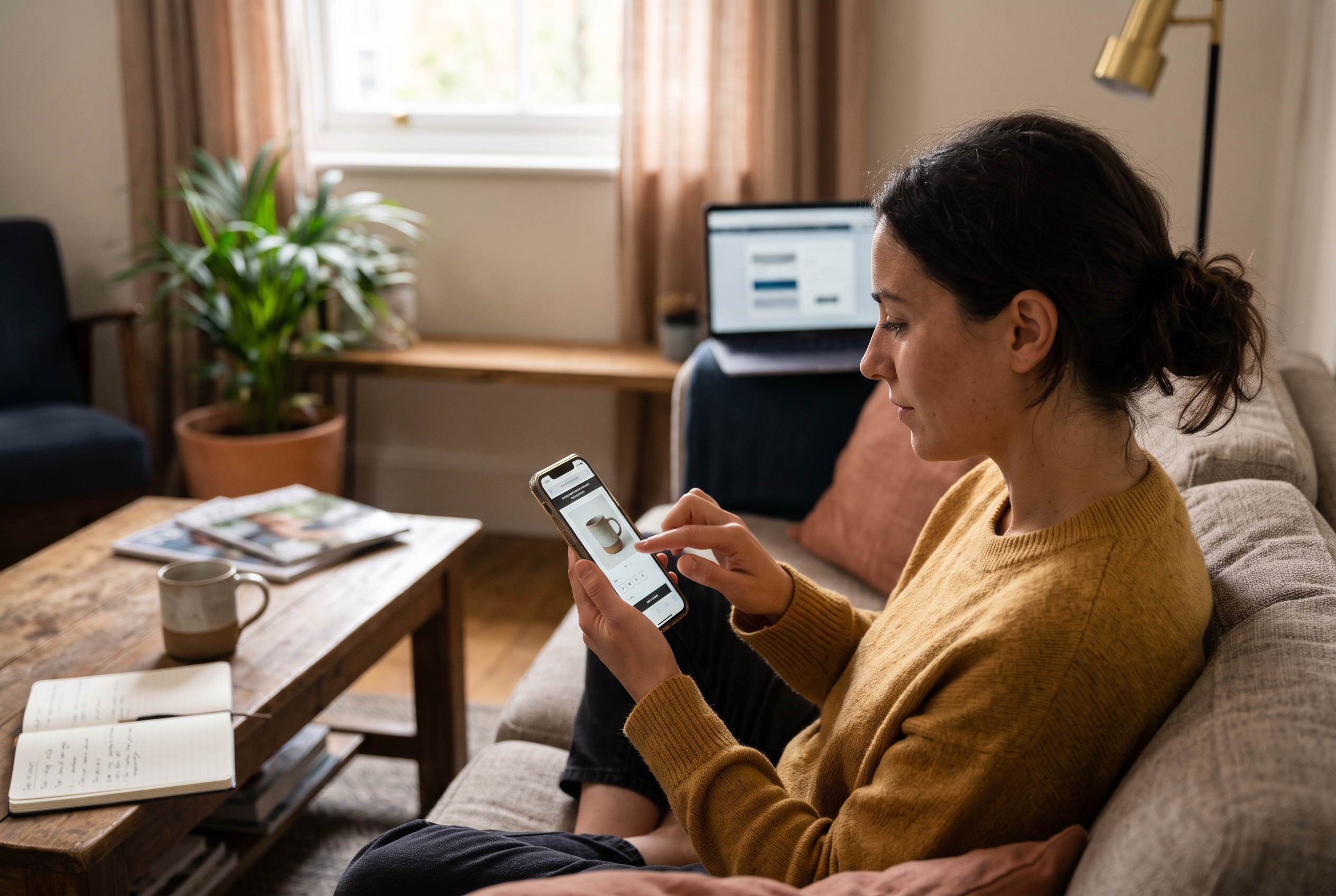
What a good quick view popup contains
A quick view popup for products should be a trimmed product page, not a copy of it. Include:
- A main image with two or three thumbnails
- Name, price and rating
- Variant selectors (size, color) with stock status
- Quantity and an add to cart button
- A "View full details" link to the real product page
Skip long descriptions, size charts and reviews tabs. If a shopper needs those, they should go to the full page, and that's fine. You've still qualified them.
When quick view helps and when it hurts
Quick view works best for catalogs where shoppers compare many similar items: fashion, home goods, beauty, accessories. It's less useful for complex products that need configuration or lots of explanation. For those, push shoppers to the full page, or consider a configurator; our product configurator guide explains when that makes sense.
Two rules keep quick view from backfiring. First, make sure the popup loads instantly, because a slow modal feels broken. Second, on mobile, use a bottom sheet or full-screen panel with a big close button. Tiny "X" icons frustrate thumbs.
Add to cart from the collection page
Letting shoppers add to cart from a collection page is the logical extension. For single-variant products, a direct "Add" button on the tile works. For products with sizes or colors, use quick view to capture the variant choice first. Never add a default variant silently; that creates wrong orders and returns.
Test it, though. Some stores see more add-to-cart events but no change in orders because shoppers add and abandon. Watch the full funnel, not just the first click. A simple check: if add-to-cart rate rises 15% but orders per session stay flat, the button is adding clicks, not sales.
Filters, Sorting and Search for a Better Browsing Experience
Filters improve the ecommerce browsing experience by letting shoppers cut a 200-product category down to ten relevant ones. Baymard Institute's product list usability benchmark, based on large-scale testing of major ecommerce sites, has found that a large share of sites still ship weak filtering and sorting, so this is not a place to cut corners.
Build filters around how people shop
Don't copy your internal catalog fields. Use the attributes shoppers actually ask about:
- Size, color, price for apparel
- Material, dimensions, style for home decor
- Skin type, ingredient, concern for beauty
- Availability so out-of-stock items don't waste clicks
Show applied filters as removable chips above the grid, and display the live result count. When a filter returns zero results, show a helpful message and suggest removing one.
Set a smart default sort
"Featured" sorting that you control by hand beats "newest" for most stores. Put bestsellers and in-stock items first, then rotate seasonal items up. Offer price low-high, high-low, rating and newest as alternatives.
Reduce bounce rate on category pages
To reduce bounce rate on category pages, fix the three usual culprits: slow load, wrong products first, and no obvious next step. If the first screen shows irrelevant items or a giant banner pushing products below the fold, shoppers leave. Keep the first row of products visible on a typical laptop and phone without scrolling.
A quick diagnostic: sort your category pages by bounce rate, then open the worst three on a mid-range phone over a throttled connection. Most of the time the cause is obvious within ten seconds, whether it's a hero banner, a slow first image or a filter panel covering the grid.
Mobile Product Listing Page Design and Speed
Mobile product listing page design should put thumb-friendly filters, two-column grids and fast-loading images first, because most ecommerce traffic arrives on phones. Statista's retail data has put mobile at roughly 60% or more of global retail site visits in recent years, even though desktop often converts higher.

Mobile layout rules
- Sticky filter and sort bar at the top or bottom of the screen
- Filters in a slide-up panel, not a sidebar
- Tap targets of at least 44px, in line with Apple's 44pt guidance (Google's Material guidance suggests 48dp)
- Two columns with shortened product names and price directly under the image
- No hover-only features, because phones don't hover
For more on the product page side of the mobile journey, see how to increase mobile conversion rate on product pages.
Speed is part of the design
Category pages carry the most images on your site, which makes them the slowest. Google's Core Web Vitals treat Largest Contentful Paint under 2.5 seconds as "good", and Cumulative Layout Shift under 0.1. To get there:
- Serve images in WebP or AVIF at the exact display size
- Lazy-load everything below the first row, but never the first row itself
- Preload the first row's images
- Reserve image space so the layout doesn't jump
- Audit apps and scripts. Every review widget, popup and tracker adds weight
That last point is the hidden cost on many platforms. Stores stacked with third-party apps for reviews, wishlists and quick view often crawl, and the listing page suffers most. It's one reason we built quick view, wishlist and reviews into Rovela as native features rather than add-ons.
Category Page Optimization for SEO and Conversion
Category page optimization means making the page rank for broad commercial searches and convert the visitors who arrive. These pages often target your highest-volume keywords, such as "women's running shoes", so they're worth the effort.
On-page SEO basics
- A unique title tag and meta description per category
- One H1 containing the category keyword
- Descriptive image alt text on product tiles
- Clean URLs without filter parameters indexed by accident
- Internal links to subcategories and top products
- Product schema where applicable; see our product schema markup examples
Put 100 to 200 words of useful buying advice below the grid. It helps search engines understand the page without pushing products down. Google's Search Central documentation covers structured data and crawling in detail.
How to Improve Product Listing Page Browsing Depth
To increase products viewed per session, give shoppers reasons to keep browsing:
- Use quick view so they don't leave the grid to check details
- Show related categories at the bottom of the page
- Keep pagination or "load more" obvious
- Add a wishlist heart so they can save items and keep exploring
- Link "recently viewed" items on return visits
Each of these keeps momentum. A shopper who views eight products is generally more likely to buy than one who views two, so track this metric against revenue per session in your own data.
How to test changes without guessing
Change one element per test: tile layout, filter position, or quick view on versus off. Run each for at least two full weeks or a few hundred conversions per variant, whichever is longer. Compare add-to-cart rate, revenue per session and bounce rate, not just clicks.
Quick Answers to Common Questions
How many products should a listing page show?
Between 24 and 36 per load is a solid range. Fewer forces extra clicks, while more slows the page, especially on mobile.
Should I show prices on collection pages?
Yes. Hiding prices adds clicks and frustrates shoppers who filter by budget. Show the sale price with the original struck through.
Is quick view bad for SEO?
No, as long as the full product pages remain crawlable and linked from the tiles. Quick view is a user interface layer, not a replacement for product URLs.
What's the fastest fix if I only have an hour?
Compress and resize your tile images, then make sure the sort default puts bestsellers first. Both are quick to do and are usually cheaper to try than a redesign.
Put It Into Practice
Improving a product listing page isn't one big redesign. It's a run of small, measurable fixes: a consistent grid, lean tiles, filters that match how people shop, quick view and add to cart from the collection page, a mobile layout built for thumbs, and images that load fast. Start with your highest-traffic category, change one thing at a time, and track products viewed per session and add-to-cart rate.
If you'd rather not stitch together apps for quick view, reviews, wishlists and filters, Rovela builds a complete store from a plain-language description with those features included by default, and you can see how the flat pricing compares with a typical app stack. It's a simple way to start with a listing page that's already built on solid ground.