By El Ghali Bennis · Published
How to Get Shoppers to Come Back to Your Online Store
Most visitors leave without buying. Learn how to get shoppers to come back to your online store with smart product pages, email, and recently viewed items.
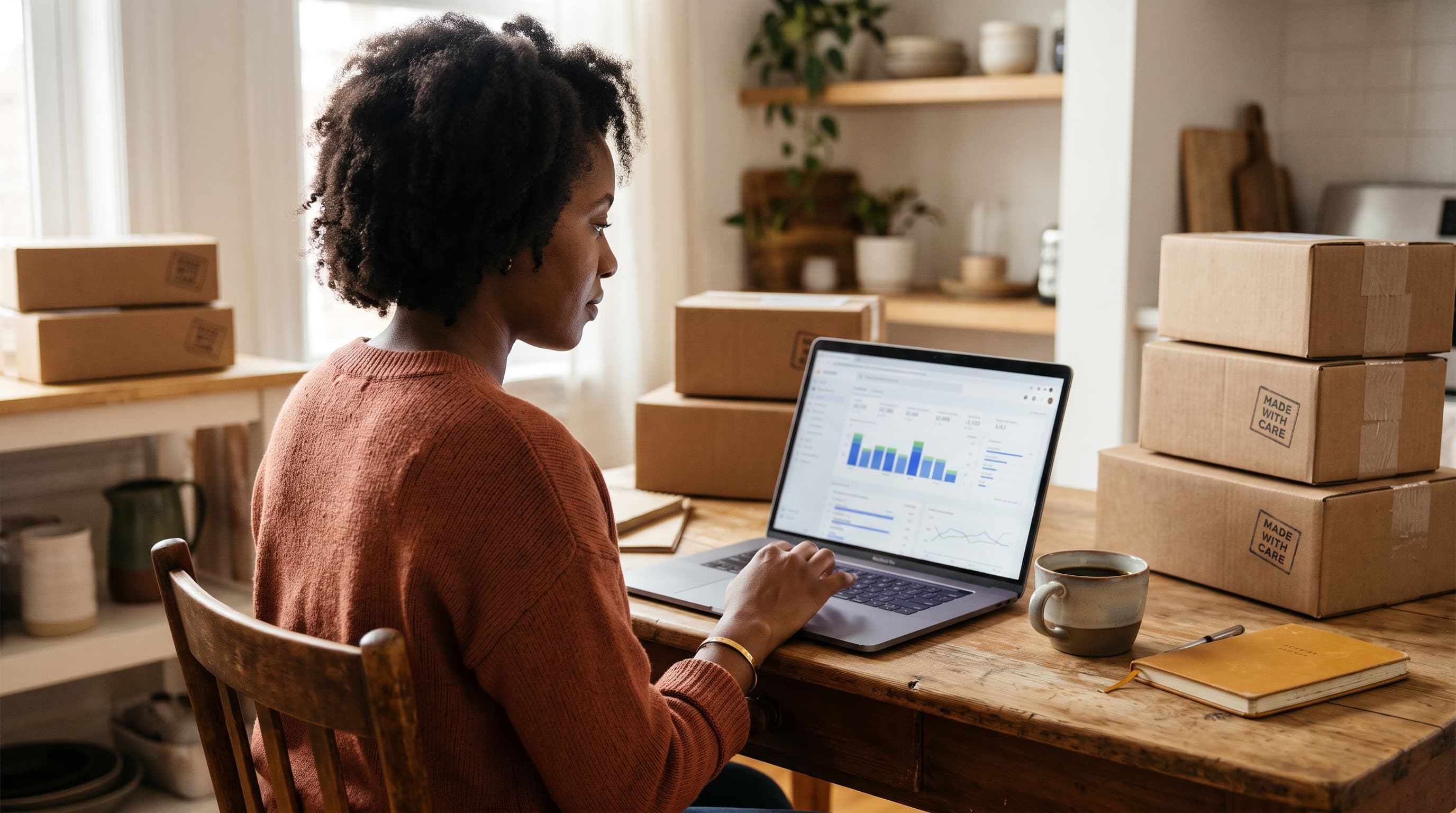
To get shoppers to come back to your online store, make returning easy and give them a reason. Show a recently viewed products section so they can pick up where they left off, capture their email before they leave, and follow up with relevant reminders. Most first-time visitors never buy, so recovery matters more than traffic.
Here's the uncomfortable math. According to Baymard Institute's cart abandonment research, roughly 70% of online carts are abandoned, and that's only the shoppers who got as far as a cart. Many more look at three products, get distracted, and vanish. This guide walks through why shoppers leave without buying and the practical steps that bring browsing shoppers back, in order of effort and payoff.
Why Shoppers Leave Without Buying
Shoppers leave because they're comparing, distracted, unsure, or surprised by cost. Almost none leave because they hate your store. They intend to come back and then can't find the thing they liked.
Understanding the cause tells you which fix to use. The usual reasons:
- Research mode. They're comparing three tabs and have no intent to buy today.
- Surprise costs. Baymard Institute's checkout surveys consistently list extra costs like shipping and taxes as the top reason for abandoning a cart.
- Trust gaps. No reviews, vague return policy, unfamiliar brand.
- Friction. Slow pages, clumsy mobile layout, forced account creation.
- Lost context. They close the tab, come back later, and can't remember what they were looking at.
That last one is the most overlooked. It's also the cheapest to fix. Picture a shopper who looked at a $120 jacket on Tuesday and sees generic bestsellers on your homepage on Thursday. You've made them start over. Many won't.
Bounce rate vs. leaving after browsing
If you're trying to learn how to reduce bounce rate in ecommerce, separate two problems. A bounce is a one-page visit, usually caused by a mismatch between the ad or search result and the landing page, or by slow loading. Browsers who view four pages and leave are a different group: they were interested. Your best recovery gains come from this second group, because they've already shown intent.
How to Get Shoppers to Come Back With a Recently Viewed Products Section
A recently viewed products section is a row of items a shopper has already looked at, shown on the homepage, product pages, cart, and 404 pages. It works because it removes the effort of remembering and searching, which is where return visits die.
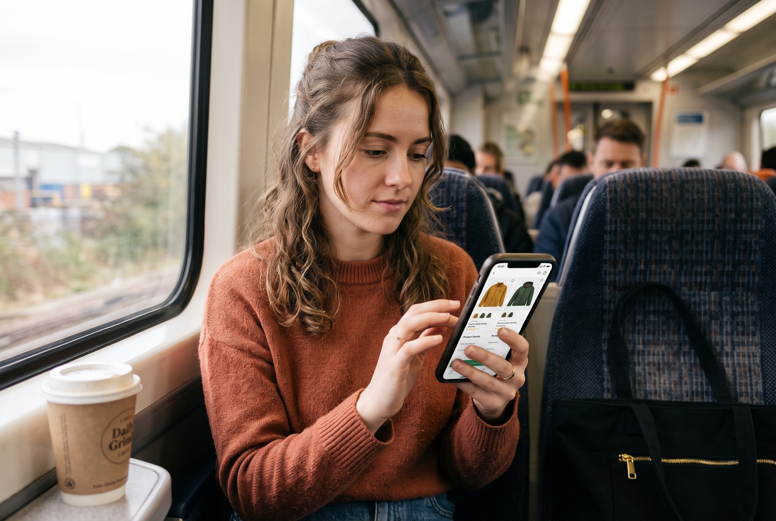
Think about how people actually shop. They view a pair of boots on their phone at lunch, then open the store on a laptop that evening. With recently viewed products on your ecommerce store, those boots are sitting right there. No search, no scrolling through categories.
What results to expect
Vendors of recommendation tools publish widely varying lift figures, and results depend on catalog size and traffic, so treat any single number with caution. A practical way to get your own benchmark is a simple before-and-after test. Here is a worked example with illustrative numbers, not a published case study: a store with 10,000 monthly sessions and 2,000 returning sessions adds the row to its homepage. If returning-session product page views rise from 2.1 to 2.6 per visit and returner conversion moves from 2.0% to 2.4%, that is 8 extra orders a month with no ad spend. Track the same three metrics (pages per returning session, returner conversion, revenue per returning session) for four weeks before and after, and you'll know what it is worth to you.
Where to place it
- Homepage, below the hero. Returning visitors see their own history first. New visitors see nothing, so it stays out of the way.
- Bottom of product pages. Lets shoppers compare what they've seen without hitting the back button.
- Cart page. Surfaces items they considered but didn't add, which is useful for bundles.
- Empty search results and 404 pages. Turns a dead end into a next step.
Design rules that keep it useful
- Show 4 to 6 items on desktop, a swipeable row on mobile.
- Put the most recent item first and hide the product the shopper is currently viewing.
- Include price and a clear image. Skip heavy badges.
- Store history in the browser for guests and in the account for logged-in customers, so it follows them across devices.
- Keep it light. A slow widget costs you more than it earns.
On a small catalog, say under 50 products, this one section often beats a complicated recommendation engine. It needs no data science, only memory.
Improve Your Product Pages and Homepage Layout
Shoppers return to stores that answer their doubts fast. Strong product pages and a clear homepage layout give people a reason to come back instead of a reason to keep comparing.
Product page conversion optimization basics
For product page conversion optimization, fix these first, in this order:
- Total price clarity. State shipping cost or free-shipping threshold near the price.
- Real photos. Multiple angles, one in context, one showing scale.
- Reviews and Q&A. Shoppers read the three-star reviews. Let them ask questions publicly and answer within a day.
- Returns in one line. "30-day returns, free" next to the button beats a policy link in the footer.
- A reason to save it. A wishlist button gives hesitant shoppers an action that isn't buying.
The wishlist deserves a note. Saving an item is a soft commitment, and it gives you something to follow up on later. Once you have their email, our guide to abandoned cart subject lines covers how to word the follow-up message so it gets opened.
Homepage layout for an online store
A good homepage layout for an online store serves two audiences at once: first-timers and returners. A simple structure that works:
- Hero with one clear promise and one button.
- Recently viewed products (appears only for returners).
- Bestsellers or new arrivals.
- Trust strip: reviews, shipping, returns.
- Email signup with a specific reason to join.
To improve ecommerce user experience overall, check your store on a mid-range phone over mobile data. If it takes more than a few seconds to show products, Google's own web performance guidance on web.dev explains why speed hits both conversion and search visibility. Stacked apps are the usual cause of slow stores, which is a big reason many merchants look at an all-in-one setup.
Bring Browsers Back With Email, SMS, and Retargeting
Once shoppers leave, three channels can pull them back: email, SMS, and paid retargeting. Email is cheapest and usually the best starting point, because you own the list.

Capture the email before they go
You can't follow up with someone you can't identify. Offer a reason to subscribe: early access to new drops, a restock alert, a first-order discount, or a saved wishlist sent by email. A generic "subscribe to our newsletter" converts poorly. A specific one ("Get notified when this size is back") converts because it solves a problem.
Browse abandonment emails
Most stores set up cart abandonment but skip browse abandonment, which targets people who viewed products but never added anything. A simple three-step flow:
- Email 1, a few hours later: "Still thinking about [product]?" with the product image and one review.
- Email 2, day 2: Answer the likely objection. Sizing help, shipping speed, return policy.
- Email 3, day 5: Show two similar items and, if margins allow, a small incentive.
If you also run texts, our examples of abandoned cart text messages show tone and timing that don't feel pushy.
Retargeting vs on-site recommendations
The debate of retargeting vs on-site recommendations is really a question of cost and timing. Here's how they compare:
| Factor | Paid retargeting | On-site recommendations |
|---|---|---|
| Cost | Ongoing ad spend per click or impression | Usually free once built in |
| When it works | After the shopper leaves | While the shopper is on your store |
| Needs consent/tracking | Yes, cookies and pixels (Meta, Google Ads) | Minimal, first-party data |
| Best for | Higher-priced items, longer decisions | Every store, especially small catalogs |
| Risk | Ad fatigue, rising costs | Clutter if overdone |
Our take: start with on-site tools and email, because they cost nothing per visit. Add retargeting through Meta or Google Ads once you have steady traffic and know your margins. Retargeting to an experience that doesn't remember the shopper is paying twice for the same problem.
Personalized Recommendations for a Small Store
You don't need a data team to personalize. Personalized product recommendations for a small store come down to three simple rules based on behavior you already have.
- Same category, different price point. If they viewed a $90 item, show a $60 and a $130 option.
- Frequently bought together. Pair accessories with the main item on product and cart pages.
- Back in stock or price drop. Alert shoppers who viewed or saved an item.
Keep recommendation rows to one or two per page. More than that and shoppers stop looking at any of them. Also watch for the mistake of recommending products they've already bought, which is the fastest way to look careless.
Loyalty and reasons to return
Some shoppers need a standing reason to come back. A points program, a replenishment reminder for consumables, or early access for past customers gives them one. For stores selling items that run out, such as skincare or pet food, a reorder email at the right interval beats any ad. Our guide to subscription ecommerce shows how to turn that into recurring revenue.
How to Measure Whether Shoppers Are Coming Back
To increase returning visitors in your online store, you have to track them. Four numbers cover most of it:
- Returning visitor rate. Share of sessions from people who've visited before. Google Analytics 4 reports new vs returning users out of the box.
- Time to second visit. Check your own data for the typical gap. If most second visits happen within a few days, your follow-up emails should land in that window.
- Returning visitor conversion rate. In many stores it runs higher than first-timers, but check yours. If it isn't higher, your returner experience needs work.
- Email-driven revenue. Revenue from browse and cart flows as a share of total.
Treat these as ecommerce conversion rate tips you can test one at a time. Change one thing, such as adding the recently viewed row to your homepage, then wait two to four weeks before judging. If you change five things at once you won't know what worked.
A simple 30-day plan
- Week 1: Add recently viewed products to the homepage and product pages. Add a wishlist button.
- Week 2: Set up an email capture with a specific offer, plus a browse abandonment flow.
- Week 3: Tighten product pages: shipping clarity, returns line, reviews and Q&A.
- Week 4: Review numbers. If traffic is steady, test a small retargeting budget on your top three products.
If you're still deciding where to find those first visitors, how to get customers for your online store for free covers the top of the funnel.
Get Shoppers to Come Back From Day One
Getting shoppers to come back to your online store isn't one trick. It's a chain: remember what they looked at, remove doubts on the page, capture their email, and follow up with something relevant. Each link is small. Together they turn a store that loses most visitors into one that recovers a meaningful share of them.
On most platforms, those pieces are separate paid apps: one for recently viewed products, one for wishlists, one for abandoned cart, one for reviews. Each adds cost and weight to your pages. Rovela includes them by default in a single flat subscription, with the store built from a plain-language conversation, so you can switch on recently viewed products, wishlist, abandoned cart, and reviews without installing anything. You can see what's included on the pricing page, or describe your store at rovela.ai and see it built.