By El Ghali Bennis · Published
How to Add Product Comparison to Online Store (2026)
Learn how to add product comparison to your online store: pick attributes, add compare buttons, build a side-by-side table and nail the mobile layout.

To add product comparison to an online store, put a compare button on each product card, let shoppers select two to four items, and open a side-by-side table showing the same attributes in the same order. Keep the table short, highlight differences, and make it work on mobile. You can build it, install an app, or use a platform that includes it.

Comparison isn't a gimmick. It's what shoppers already do in six browser tabs, and every tab you lose is a sale that might leave with them. Below you'll find how the feature works, which product attributes to compare, how to design it, how to code the core logic, and three ways to ship it.
Why a Product Comparison Feature Pays Off
A product comparison feature in ecommerce keeps shoppers on your site while they decide between similar items. It replaces tab-juggling and memory with one clear table, which reduces choice overload and makes the final decision easier.
Choice overload is well documented, though not uniform. Sheena Iyengar and Mark Lepper's 2000 paper in the Journal of Personality and Social Psychology, "When Choice Is Demotivating," found that shoppers at a tasting display with 24 jams were far less likely to buy (about 3% did) than those who saw 6 (about 30%). Later meta-analyses show the effect depends on how hard the options are to tell apart. That's exactly why comparison helps: it makes similar options easy to tell apart instead of cutting your range.
Baymard Institute, which researches ecommerce usability, has run large-scale usability tests of product lists and comparison tools. Its published findings show many sites still make users compare specs from memory, because attributes are inconsistent or the comparison view is hard to find. Check Baymard's current benchmark before you design, since its figures are updated regularly.
When comparison helps most
- Technical products: laptops, cameras, skincare with different actives, supplements.
- Tiered products: good/better/best lines, subscription boxes, mattress ranges.
- Variants that look alike: three coffee grinders at $49, $79 and $129.
- High-ticket items: anything where the buyer researches for days.
When to skip it
If you sell 12 unique handmade items, each with its own story, a comparison tool adds clutter. Better product pages and proven product page layouts will do more for you.
Which Product Attributes to Compare
The best product attributes to compare are the ones shoppers use to choose: price, the two or three specs that actually differ, ratings, and availability. Ten or fewer rows is the sweet spot. More than that and the table becomes the very overload you're trying to fix.

Start from the questions customers ask
Open your support inbox and your customer Q&A section. Questions like "Is it waterproof?" or "Which one is better for oily skin?" tell you exactly which rows belong in the table. Your customers have already written the spec list for you.
Attribute examples by category
| Category | Attributes to compare |
|---|---|
| Apparel | Material, fit, sizes available, care instructions, price |
| Skincare | Skin type, key actives, size in ml, scent, rating |
| Electronics | Battery life, weight, connectivity, warranty, price |
| Furniture | Dimensions, material, assembly time, delivery window |
| Supplements | Servings, dose per serving, certifications, cost per serving |
Notice the derived values. "Cost per serving" or "price per ml" does the math for the shopper, and it's often the row that decides the sale. A $36 tub with 30 servings ($1.20 each) beats a $29 tub with 20 servings ($1.45 each), but nobody sees that without a calculated row.
Structure your data first
A comparison table is only as good as your catalog data. If one product lists "Weight: 1.2 kg" and another says "light," the table breaks. Use consistent fields, units and naming for every product in a category. This is also what powers filters and product schema markup, so the work pays off twice.
How to Add Product Comparison to Your Online Store, Step by Step
Adding product comparison takes six steps: define the attributes, add compare buttons, store selections, build the table, handle edge cases, and test. You can do it by code, with an app, or with a platform that has it built in.
- Define attributes per category. Pick 6 to 10 rows from the list above and make sure every product has values.
- Add compare buttons to product cards. A small checkbox or "Compare" toggle on each card, and a repeat on the product page.
- Store the selection. Keep chosen product IDs in local storage or the session so the list survives navigation.
- Show a sticky compare tray. A bar at the bottom shows selected thumbnails and a "Compare now" button.
- Build the side by side table. Products as columns, attributes as rows, with an add-to-cart button under each product.
- Test edge cases. One product selected, five selected, out-of-stock items, and missing values.

How to store selections and build the table in code
If you go custom, the logic is small. Keep an array of product IDs in localStorage under a key like compare. On each compare click, read the array, add or remove the ID, enforce your cap, and save it back:
const KEY = 'compare';
const MAX = 4;
function toggle(id) {
  let ids = JSON.parse(localStorage.getItem(KEY) || '[]');
  if (ids.includes(id)) ids = ids.filter(i => i !== id);
  else if (ids.length < MAX) ids.push(id);
  else return alert('You can compare up to 4 products.');
  localStorage.setItem(KEY, JSON.stringify(ids));
  renderTray(ids);
}
For the table, fetch the selected products from your catalog by ID, then loop over a fixed list of attribute keys so every row appears in the same order. Render an em dash where a value is missing rather than leaving the cell empty. To highlight differences, compare each row's values with a new Set(values).size > 1 check and add a CSS class to rows that differ. Make the table a real HTML table with th header cells so screen readers can navigate it.
Three ways to build it
| Approach | Typical cost | Trade-off |
|---|---|---|
| Custom code | Developer hours, often several days | Full control, but you maintain it |
| App or plugin | Monthly app fee on platforms like Shopify or WooCommerce plugins | Quick start, but can slow pages and conflict with other plugins |
| Built-in feature | Included in the platform plan | Fewer moving parts, limited to what the platform offers |
If you go the app route, check page speed before and after. Each added script costs load time, and Google's web.dev documentation on Core Web Vitals explains why that matters for rankings and conversion. Stacked apps also add up financially; the same logic applies to review app costs.
How to add a compare button to product cards
Keep the button quiet. A text link or checkbox labeled "Compare" in the card's lower corner works. Don't let it compete with "Add to cart." Once an item is selected, change the label to "Added" with a check mark so shoppers get instant feedback.
Cap selections at four products on desktop and three on mobile. If someone tries a fifth, show a short message rather than silently failing.
Product Comparison Page Design That Converts
Good product comparison page design makes differences obvious at a glance. Use a clean table with sticky product headers, aligned rows, a "highlight differences" toggle, and one clear call to action per product. Remove anything that doesn't help someone choose.
Product comparison table examples of what works
- Sticky header row: product image, name, price and add-to-cart stay visible while scrolling long tables.
- Grouped rows: "Performance," "Size," "Materials" headings break up long specs.
- Difference highlighting: shade rows that differ, or hide rows that are identical.
- Plain-language values: "Lasts 12 hours" beats "Battery: 4,000 mAh" for most shoppers. Show both if you can.
- A recommendation badge: "Best for beginners" or "Best value" helps people who don't want to analyze anything.
Apple's Mac and iPad "Compare" pages show the pattern well: a few columns, a large product image on top, a starting price, and short grouped rows covering chip, display, battery and weight. Dyson's compare tool does something similar for vacuums and hair tools, letting you pick models from dropdowns at the top of each column. Neither shows more than a handful of rows before a "show all specs" expansion. Copy that restraint, then simplify further for your own catalog.
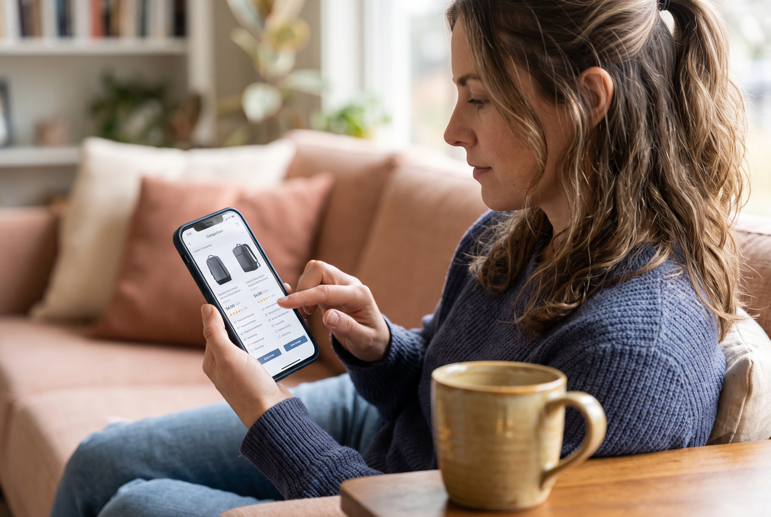
Mobile product comparison layout
A four-column table doesn't fit on a phone, and mobile is where most browsing happens. Three layouts work:
- Two-column view with horizontal swipe for extra products, keeping the attribute labels pinned on the left.
- Stacked cards where each product lists its attributes, with a toggle to switch to table view.
- Accordion rows where the shopper taps an attribute to see values for every product.
Whichever you pick, make tap targets at least 44 pixels tall and keep the add-to-cart button reachable without scrolling back to the top. Test on a real phone, not only a browser's responsive mode.
Product Comparison Best Practices
The core product comparison best practices: limit rows, standardize data, show real differences, keep price and add-to-cart visible, and measure results. Treat the feature as a decision aid, not a spec dump.
Help customers choose between products
Specs alone don't decide. Add a one-line "who it's for" under each product name. Pair it with reviews: a rating and review count per column gives social proof right where the decision happens. If you haven't set that up, see how to add product reviews to your online store.
Link comparison to your product options
If your products have variants or custom choices, show them. A shopper comparing two jackets cares about available sizes and colors. For made-to-order goods, custom product options belong in the table too.
Don't hurt SEO
Dynamic comparison pages can create thousands of near-duplicate URLs. Keep selection state in local storage rather than the URL, or add a noindex tag to generated comparison pages. Meanwhile, curated pages like "Best espresso machines under $300" can rank on their own and deserve proper content.
Measure what matters
Track these in your analytics tool:
- Compare usage rate (sessions using compare divided by product-list sessions)
- Conversion rate of compare users versus everyone else
- Average order value after comparison
- Exit rate on the comparison page
Compare users usually self-select as serious buyers, so their conversion will look high. The real test is whether overall category conversion rises after launch. Run it for four weeks before judging.
Common mistakes
- Comparing products with different attribute sets, which leaves empty cells.
- Hiding the compare button below the fold on product cards.
- Allowing ten products, which recreates the overload problem.
- Forgetting mobile until after launch.
- Showing specs without prices or a buy button.
Which Ecommerce Comparison Tool to Add to Your Online Store
Choose the simplest option that fits your catalog size and skills. Under 50 products and a developer on hand, custom code is fine. Otherwise, a built-in feature beats an app because it won't add scripts, monthly fees or conflicts.
Many merchants discover that comparison is one of several features locked behind paid add-ons. App stacks vary widely, so add up the monthly fees of every app you'd need on top of the base plan before you commit. WooCommerce has its own maintenance cost in plugins and updates. If you're weighing platforms, the ecommerce builder comparison shows what's included where.
A quick decision guide:
- Few products, tight budget: build a simple custom table on key landing pages.
- Large catalog with consistent specs: use a built-in or well-tested compare tool tied to your attribute fields.
- Many variants and options: pick a tool that handles variant-level data, not just parent products.
Add Product Comparison Without the App Stack
You've got the plan: clean attributes, a quiet compare button, a sticky tray, a short table, and a mobile layout that holds up. Start with one category, measure for a month, then expand.
If you'd rather not assemble this yourself, Rovela builds a complete store from a plain-language description, with 100+ features included in a flat subscription instead of per-app billing. You can ask in chat for a compare feature on a category and refine it from there. See Rovela's pricing or start building free at rovela.ai.